
Grid Tile Layouts with auto-fit and minmax
Tile layouts are probably the most common layout we build as frontend devs. Especially for content areas. And they've never been easier to create thanks to the new minmax and auto-fit magic that comes with CSS Grid. Lemme show you the new & easy way to make perfect, responsive tile layouts with CSS Grid.
Tiles Everywhere
You might recognize some of these. Pretty much all the pages in Google Music are tile layouts:

Side note: is it just me or are so many new releases terrible? It's like they just gave up. I mean one of the bands is literally named Garbage.
Anyway, many blogs like mine present posts in tile format:
You've probably never seen the Twitter moments page cause it's worthless, but it's also just a tile layout where some grid items span more cells:

You get the idea. Tile layouts are everywhere.
auto-fit was Made for This
We use the new auto-fit keyword to create tile layouts. It instructs the Grid to create as many columns of the given size as can fit in the space of the grid container.
So say we want to divide our Grid into as many 200px columns as can fit in the space:
.app {
  display: grid;
  grid-gap: 15px;
  grid-template-columns: repeat(auto-fit, 200px);
}

There was enough room in this 1400px div to create six 200px columns with 15px column gaps between them.
You could call that good enough and ship it at this point and your tile layout would be as good as many on the interwebs. But look at the right side of our Grid - there's a big empty area that doesn't look too great — where there wasn't enough room for another column.
CSS Grid is well equipped to help us make this tile layout even better.
minmax() Has your Back
We can adjust our tile layout to make our tiles fill up all the space in the Grid rather than leaving empty room at the end.
We do that by creating flexible columns with minmax.
.app {
  display: grid;
  grid-column-gap: 15px;
  grid-template-columns: repeat(auto-fit, minmax(200px, 1fr));
}

No more wasted space on the right!
How the devil did that work?
minmax(200px, 1fr) made our columns start out at their minimum size of 200px. So the Grid created as many 200px as could fit — six. Leaving roughly 130px of free space remaining on the right just like before. But this time the Grid then evenly distributed that extra space to the six columns since their maxiumum size was set to 1fr (1 fraction of the free space).
This combination of auto-fit and minmax makes our tile layout both flexible and full-width.
Responsive Ready
The best part is - a tile layout built this way is already good to go on smaller mobile screens.

Any time there's no longer room for a 200px column, the Grid automatically creates a new row and pushes items down into it. The maximum minmax value of 1fr ensures the items always fill the entire row. This is just one of the reasons why CSS Grid is so great for responsive layouts.
Even Cooler Layouts with Tile Patterns
Now that you see how the basics of a Grid tile layout work, let's have some fun with it.
When we use repeat() we can have it repeat not just one track, but a pattern of tracks.
.app {
  display: grid;
  grid-column-gap: 15px;
  grid-template-columns: repeat(auto-fit, minmax(300px, 1fr) 150px);
}
This time we've told our Grid to repeat as many sets as can fit, where a set consists of a flexible 300px column plus a fixed 150px column.

This layout worked the same way as before except this time only the flexible minmax columns scored some of the extra space after the auto-fit algorithm did its thing.
Vary Them Tiles
I mentioned earlier that the Twitter moments page is just a tile layout with some grid items spanning more cells. Let's do something similar and make every third grid item span two columns, and every fifth one span two rows.
.item:nth-of-type(3n) {
  grid-column: span 2;
}

.item:nth-of-type(5n) {
  grid-row: span 2;
}
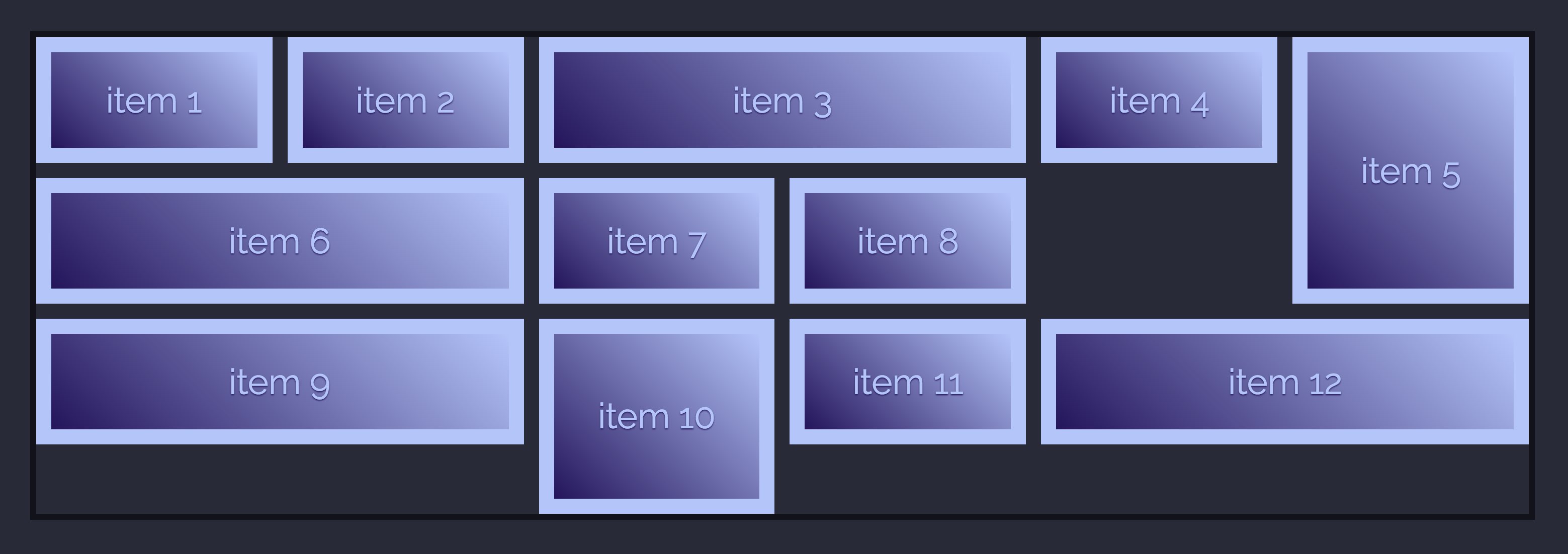
The result is pretty cool, but would look even better if we used the dense grid item placement.
.app {
  grid-auto-flow: dense;
}

This caused the grid to return to previously skipped cells and pack the items in as densly as possibly.
Now for a Practical Example
Google Music, Twitter, and blogs layouts are fine. But let's see this in action for something far more inspiring: a photo gallery of Sam — the best dog in the world.
One new bit I'll add for this is to use grid-auto-rows to make all the rows that auto-fit generates be 200px tall.
.gallery {
  display: grid;
  grid-gap: 15px;
  grid-template-columns: repeat(auto-fit, minmax(200px, 1fr));
  grid-auto-rows: 200px;
  grid-auto-flow: dense;
}

.wide {
  grid-column: span 2;
}

.tall {
  grid-row: span 2;
}

Awww what a good little beast. She looks even more adorbs in a tile layout.
If You Only Knew the Power of the Grid
CSS Grid is fantastic and we're only beginning to discover what we can do with it. I'm loving it for magazine layouts, game sites, and even the games themselves that I'm building.
I consider tile layouts a solved problem with CSS Grid. Here's a code example you can go play with.
The next time you need a tile layout, CSS Grid auto-fit & minmax has got you covered!

Master CSS Grid right from the start by playing this new mastery game. You'll learn the ins and outs of Grids one fun level at a time, while saving an adorable alien life form from certain destruction.Master CSS Grid