
Overlapping Grid Items
Now that CSS Grid has arrived, we're starting to see more and more magazine style layouts on the web. And for good reason: they're clean, readable, attractive, and familiar. You might even be tasked with building one right now. If not, you almost certainly will soon.
The secret to an awesome magazine-style grid layout is:
2. break out of the grid with overlapping grid items.
Now that you know about this little formula you're going to start noticing it everywhere. On the front and back of your favorite cereal box. In your grandma's magazines. And increasingly, in your favorite web sites/apps.
Here's how to build awesome magazine-style grid layouts by overlapping grid items.
How to Overlap CSS Grid Items
In order to overlap grid items, you have to get them positioned into the same grid cells. There are four ways to accomplish that:
- using grid line numbers
- using named grid lines
- using named grid areas
- spanning grid items
Let's take a look at a 3x3 grid containing two grid items, and compare these overlapping techniques. Let's position Item 1 (purple) into the top row, and Item 2 (red) into the left column, letting the two items overlap in the top left corner (row 1, column 1).
grid line numbers
The browser automatically numbers each grid line, staring with the number 1 and ending with number of tracks + 1.
.app {
  display: grid;
  grid-template-rows: 100px 1fr 100px;
  grid-template-columns: 150px 1fr 150px;
}

.item.one {
  grid-row-start: 1;
  grid-row-end: 2;
  grid-column-start: 1;
  grid-column-end: 4;
}

.item.two {
  grid-area: 1 / 1 / 4 / 2;
}
For item 1 we used the longhand grid-[row|column]-[start|end] keywords. For item 2 we used the convenient grid-area shorthand that sets all four positioning settings at once.
Since both items are instructed to occupy the top left cell of the grid, they overlap.
named grid lines
Using the automatic line numbers is straightforward enough, but can become hard to work with later if you're changing your Grid a bunch, like in a responsive design or even just changing your mind while you work on the layout.
So instead of numbers we can name the lines ourselves, and position our items using our custom line names.
.app {
  display: grid;
  grid-template-rows: [header-start] 100px [header-end content-start] 1fr [content-end footer-start] 100px [footer-end];
  grid-template-columns: [sidebar-start header-start footer-start] 150px [sidebar-end content-start] 1fr 150px [content-end header-end footer-end];
}

.item.one {
  grid-area: header-start / sidebar-start / header-end / content-end;
}

.item.two {
  grid-area: header-start / sidebar-start / footer-end / sidebar-end;
}
The syntax for naming lines is line, track, line. Here's a full guide on naming grid lines.
named grid areas
Named grid areas are my go-to when I start building a new grid layout. The grid-template-areas property is essentially just a shortcut for quickly naming your grid lines.
.app {
  display: grid;
  grid-template-rows: 100px 1fr 100px;
  grid-template-columns: 150px 1fr 150px;
  grid-template-areas: "header header header"
                      "sidebar content content"
                      "footer footer footer";
}

.item.one {
  grid-area: header-start / sidebar-start / header-end / content-end;
}

.item.two {
  grid-area: header-start / sidebar-start / footer-end / sidebar-end;
}
Notice how we kept the exact same item positioning from the last example, but named our lines in a lot cleaner fashion thanks to grid-template-areas.
An important thing to note with grid areas is that cells can only have one name. That top left cell where we overlap things we can't name both "header" and "sidebar". So while we could simplify item 1 to position it into the "header" area, item 2 still needs to use the line names that grid-template-areas created:
.app {
  display: grid;
  grid-template-rows: 100px 1fr 100px;
  grid-template-columns: 150px 1fr 150px;
  grid-template-areas: "header header header"
                      "sidebar content content"
                      "footer footer footer";
}

.item.one {
  grid-area: header;
}

.item.two {
  grid-area: header-start / sidebar-start / footer-end / sidebar-end;
}
spanning grid items
The last way to make grid items overlap is by spanning into the same cell.
.app {
  display: grid;
  grid-template-rows: 100px 1fr 100px;
  grid-template-columns: 150px 1fr 150px;
  grid-template-areas: "header header header"
                      "sidebar content content"
                      "footer footer footer";
}

.item.one {
  grid-row: 1;
  grid-column: span 3 / -1;
}

.item.two {
  grid-row-start: 1;
  grid-column-start: 1;
  grid-row-end: span 3;
}
Here we've attached item 1 to the last line on right by using -1, and made it span 3 columns startwards (to the left).
Item 2 we've told to start in row 1 column 1, and span 3 rows.
When using the spanning method be sure your items specify the row where you want them, otherwise the grid item placement algorithm will move them down to the next available empty slot instead of overlapping. To visualize exactly how that works see how items flow into a grid.
Control the Stack with Z-Index
Once your grid items are overlapping like you want, you can control which one is on top using z-index.
Let's make item 1 be on top for a change:
.app {
  display: grid;
  grid-template-rows: 100px 1fr 100px;
  grid-template-columns: 150px 1fr 150px;
  grid-template-areas: "header header header"
                      "sidebar content content"
                      "footer footer footer";
}

.item.one {
  grid-row: 1;
  grid-column: span 3 / -1;
  z-index: 2;
}

.item.two {
  grid-row-start: 1;
  grid-column-start: 1;
  grid-row-end: span 3;
}
Let's Build One!
Now that you know how to overlap grid items let's check out a real-world example! Here is a page in PC Magazine talking about Divinity 2: Original Sin 2 game (a way fun little game BTW).
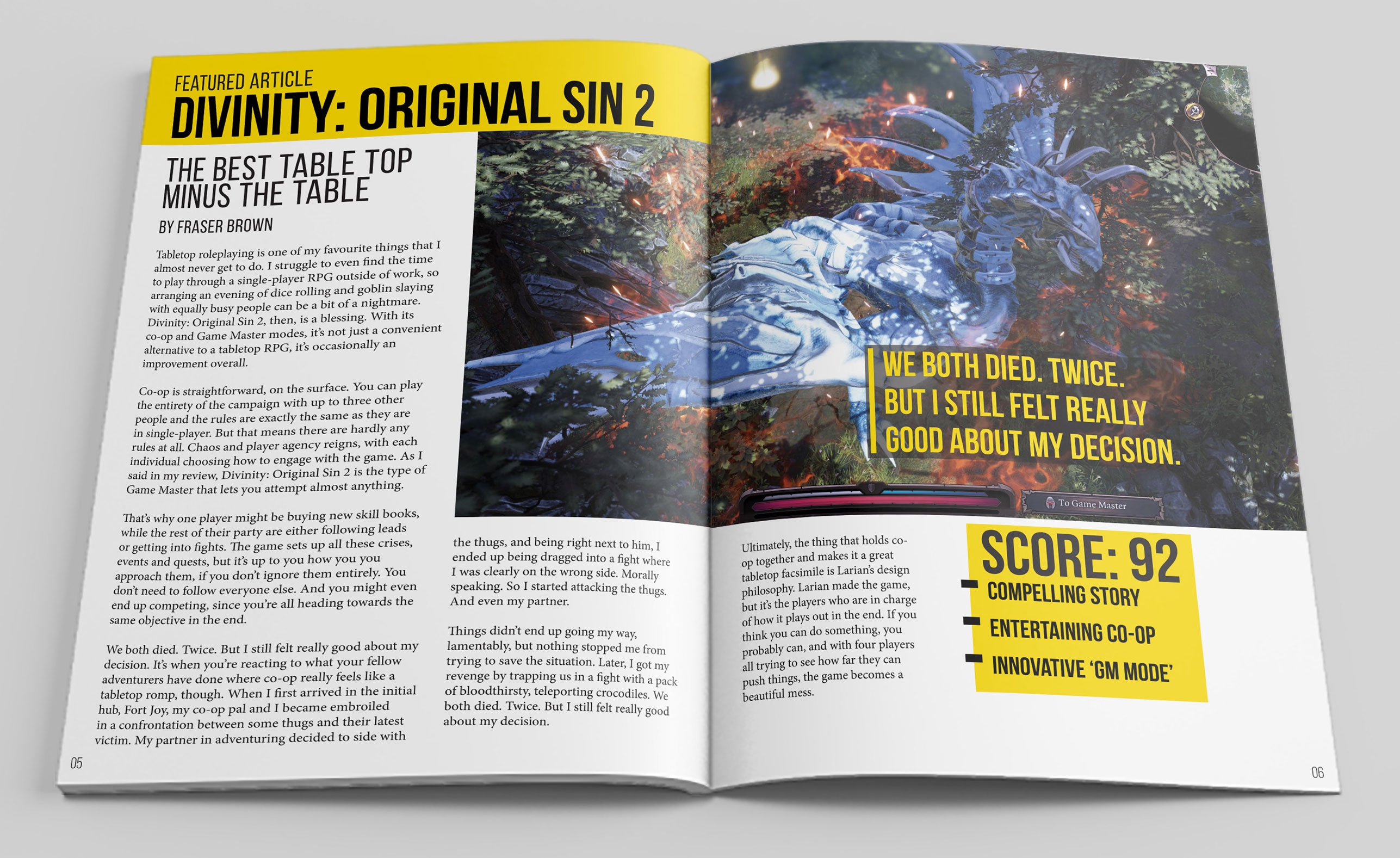
Here's how we can break this layout up into a grid:
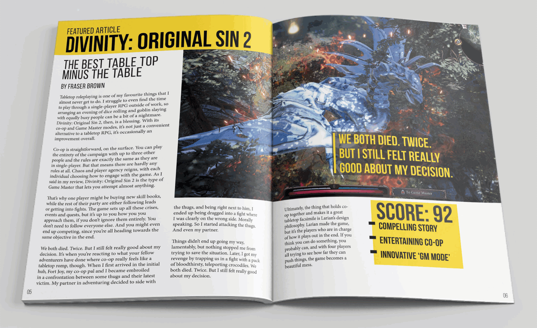
This grid has four columns. The outer columns are a bit wider than the inner ones. We've got three rows - the top one is roughly 130px. The middle row is about twice as big as the bottom row.
Let's drop some divs into our grid and see we what we have.
.magazine {
  width: 95vw;
  outline: 6px solid #121219;
  display: grid;
  grid-template-rows: 130px 2fr 1fr;
  grid-template-columns: 1.5fr 1fr 1fr 1.5fr;
}
Our divs are being positioned using the default grid placement algorithm. This grid is pretty simple so let's use the grid line numbers approach for positioning.
.magazine {
  width: 95vw;
  height: 90vh;
  outline: 6px solid #121219;
  display: grid;
  grid-template-rows: 75px 2fr 1fr;
  grid-template-columns: 1.5fr 1fr 1fr 1.5fr;
}

.title {
  grid-row: 1;
  grid-column: 1 / 3;
}

.image {
  grid-row: 1 / 3;
  grid-column: 2 / 5;
}

.content1 {
  grid-row: 2 / 4;
  grid-column: 1 / 2;
}

.content2 {
  grid-row: 3 / 4;
  grid-column: 2 / 4;
}

.quote {
  grid-row: 2;
  grid-column: 4;
}

.score {
  grid-row: 3;
}
There we go. This grid contains same items as before, but now they're positioned and overlapping how we want them.
We had to break the content up into two grid items to achieve this L-shape of content. The CSS Grid spec doesn't currently have a way to let text flow from one grid item to another, and grid areas have to be rectangular.
At this point the overall layout is pretty much done. If we add a bit of content and refine a couple of styling details it begins to resemble the magazine:
.magazine {
  width: 95vw;
  height: 800px;
  outline: 6px solid #121219;
  display: grid;
  grid-template-rows: 130px 2fr 1fr;
  grid-template-columns: 1.5fr 1fr 1fr 1.5fr;
  background: #e5e5e5;
}

.item {
  border: none;
  text-shadow: none;
  color: #000;
}

.title {
  grid-row: 1;
  grid-column: 1 / 3;
  z-index: 1;
  background: #f4d434;
  color: black;
  justify-content: start;
  align-items: end;
  text-transform: uppercase;
  font-weight: bold;
  font-size: calc(10px + 2.6vw);
  padding-left: 20px;
  display: grid;
}

.emph {
  transform: scaleY(1.5);
  white-space: nowrap;
}

.image {
  grid-row: 1 / 3;
  grid-column: 2 / 5;
  background: url(https://gedd.ski/img/divinity-dragon.jpg);
  background-repeat: no-repeat;
  background-position: center center;
  background-size: cover;
}

.content1 {
  grid-row: 2 / 4;
  grid-column: 1 / 2;
  overflow: hidden;
  font-size: 16px;
  display: block;
}

.content2 {
  grid-row: 3 / 4;
  grid-column: 2 / 4;
  overflow: hidden;
  font-size: 16px;
  display: grid;
  grid-template-columns: 1fr 1fr;
  grid-column-gap: 30px;
  align-items: start;
}

.content1, .content2 {
  padding: 10px 20px;
  font-size: 14px;
}

.quote {
  grid-row: 2;
  grid-column: 4;
  z-index: 2;
  background: rgba(0,0,0, .5);
  align-self: end;
  justify-self: start;
  position: relative;
  color: #e5d54f;
  border-left: 10px solid #e5d54f;
  padding: 10px;
  right: 125px;
  bottom: 6%;
  text-transform: uppercase;
  font-size: calc(12px + 1.1vw);
}

.score {
  grid-row: 3;
  background: #f4d434;
  width: 70%;
  height: 70%;
  display: flex;
  align-items: flex-start;
  justify-content: flex-start;
  padding: 5px;
  font-size: calc(12px + 2.6vw);
  font-weight: bold;
  text-transform: uppercase;
}
Not bad eh?! We could spend more time making it pixel-perfect and mobile friendly, but this is good enough for this exercise.
One interesting thing to check out is that quote box that's overlapping the game image. It's positioned into the 2nd row, 4th column. But we used position: relative to shift it up and to the left to break out of the grid a bit, just like it does in the magazine. Keep an eye out for this. Oftentimes layouts that don't appear to be a grid actually are, just with some clever item shifting.
Overlap your Grid Items
Creating magazine-style layouts on the web has never been easier thanks to CSS Grid and the ability to overlap grid items.
There are also a ton of cool effects you can achieve by overlapping grid items. For example combining it with background blend modes. You can even mimic styling grid gaps.
Go try it yourself! Tear a page out of any physical magazine — at the dentist, your grandma's, wherever you can find one. Build that magazine layout using CSS Grid and overlapping some of the grid items. Don't forget z-index for the stacking order. Have fun!
Master CSS Grid right from the start by playing this new mastery game. You'll learn the ins and outs of Grids one fun level at a time, while saving an adorable alien life form from certain destruction.Master CSS Grid