How Items Flow Into a CSS Grid
There you are, happily working on a brand new Grid layout - this powerful new tool making you feel like The Rock of UI developers - when suddenly you change a single item's position and it throws the entire thing into a jumbled mess of blocks and spaces that would make the hardest level in Tetris look easy.
What the junk, how did that get there?!
Being skilled with Grid layout takes a lot more than just memorizing syntax. One critical part to understand is how the browser places items into your Grid. The modern way to size and position things in CSS is using Grid Lines. But there's another piece of magic at work here - an algorithm that calculates which items to prioritize placing first, and exactly how to flow everything into the Grid.
Grid Item Placement - Visualized
The CSS spec calls it the Grid Item Placement Algorithm. Unlike all the other standards specs, this one is massive and complex (zing)!
I wanted students of Grid Critters to come away with a solid understanding and intuition around this important aspect of Grid layout. So I built a spec-compliant animated placement engine into my game that shows you this algorithm in action.
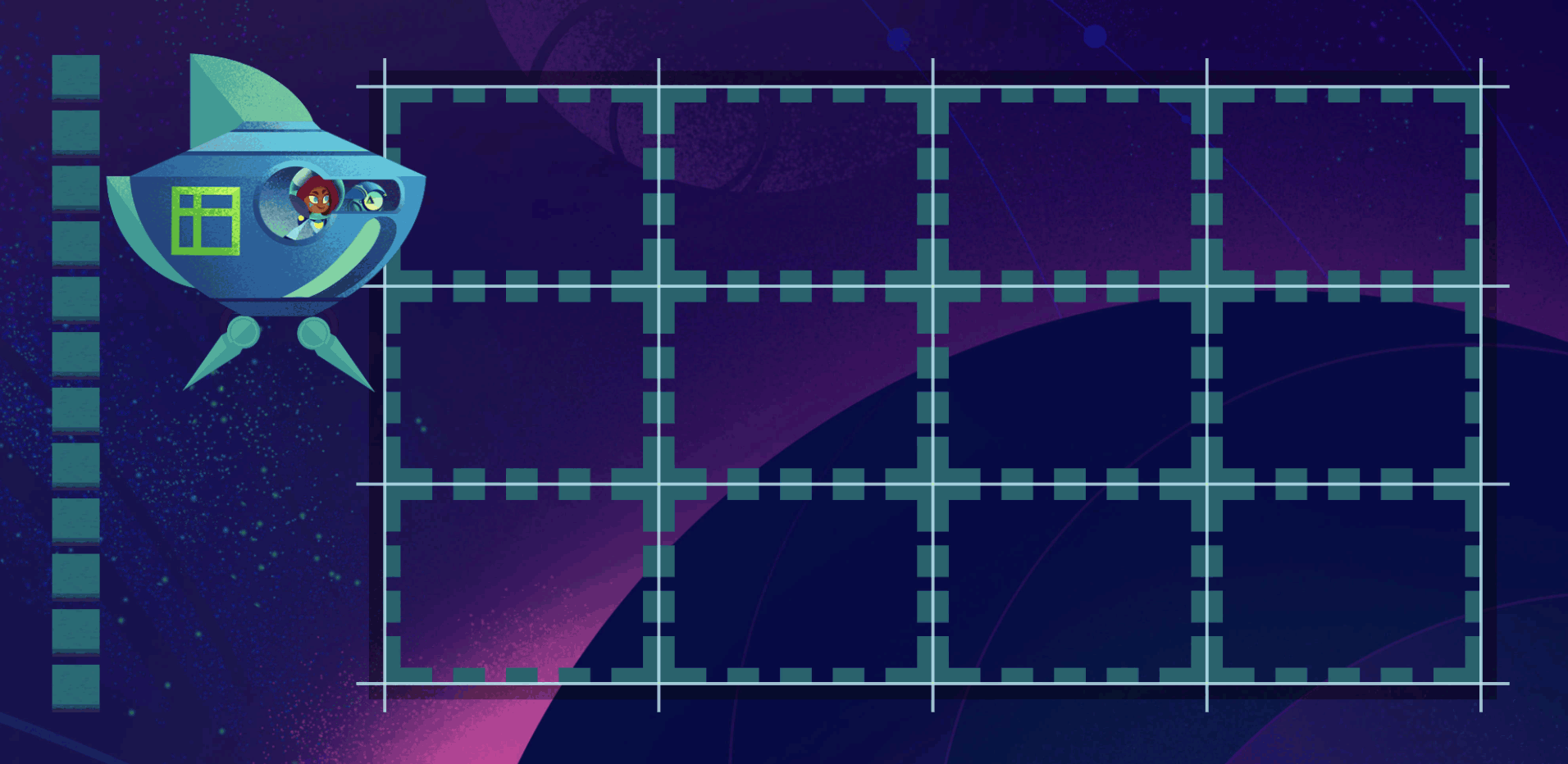
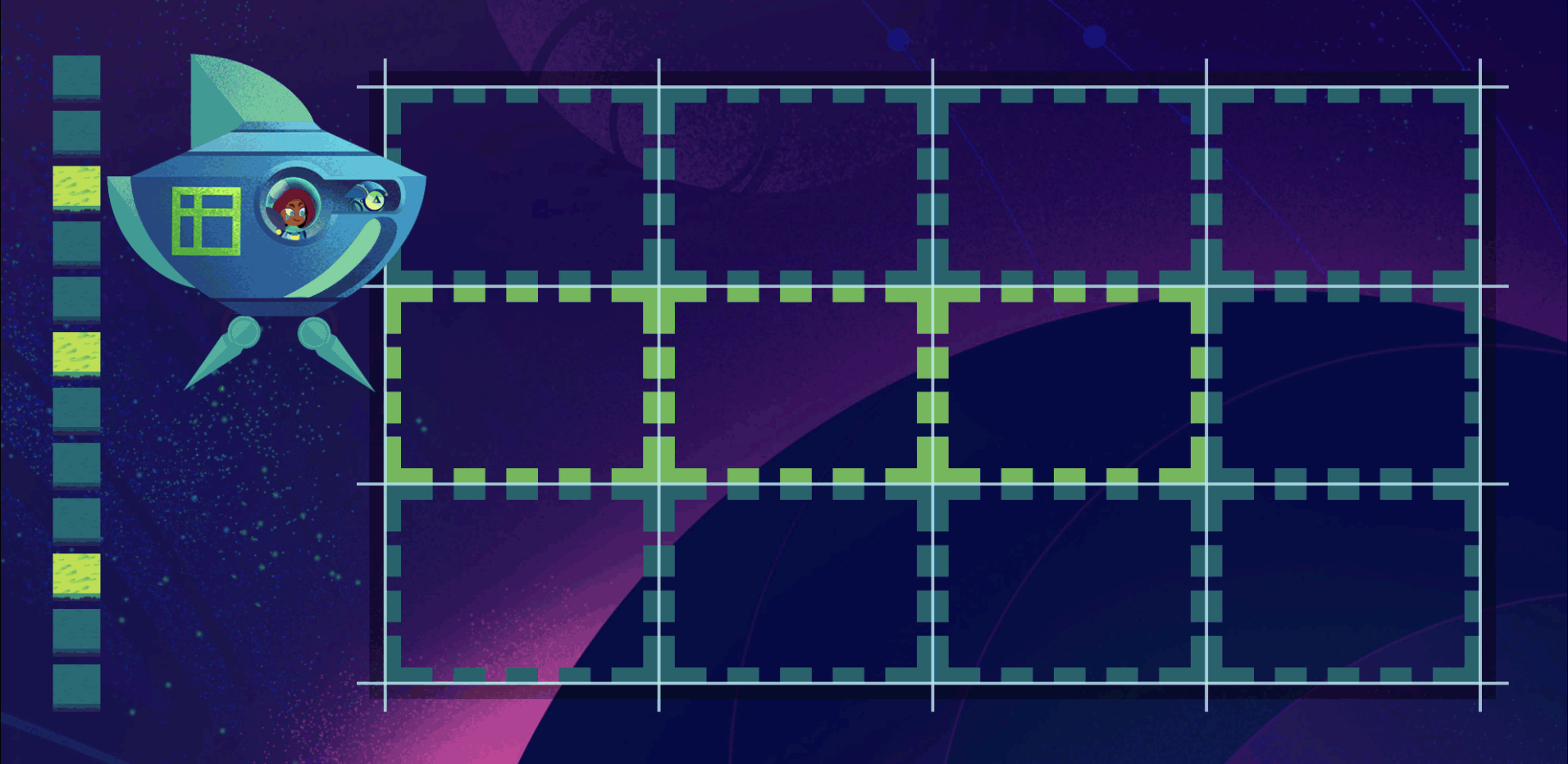
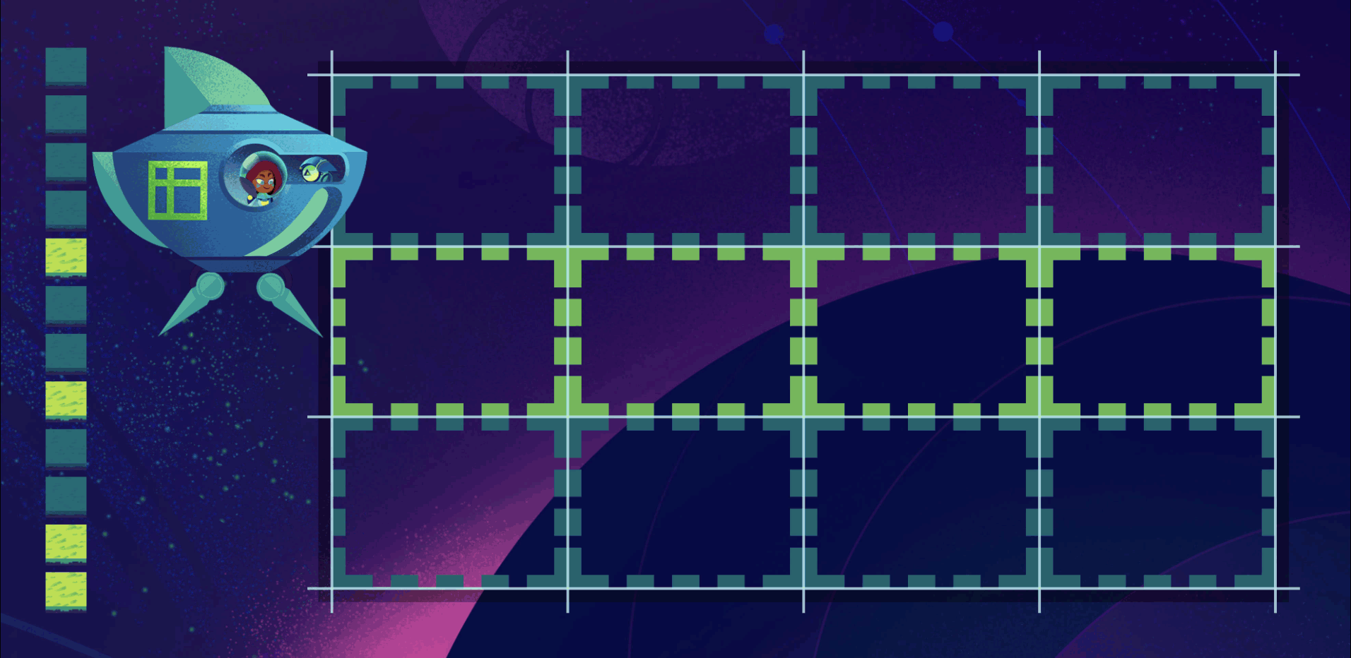
I'll use examples from it here to illustrate the basics of how grid items flow into a 4x3 Grid:
planet {
  display: grid;
  grid-template-columns: repeat(4, 1fr);
  grid-template-rows: repeat(3, 1fr);
}
The green terrain items we'll use are stacked to the left of the shuttle to show their order in the DOM.
Auto
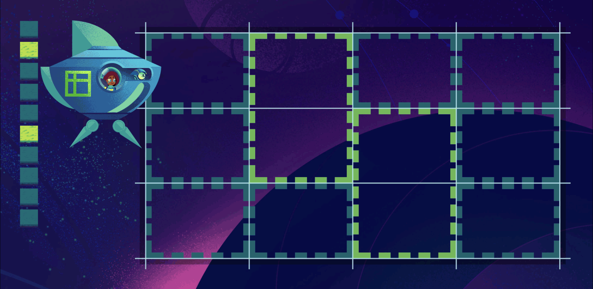
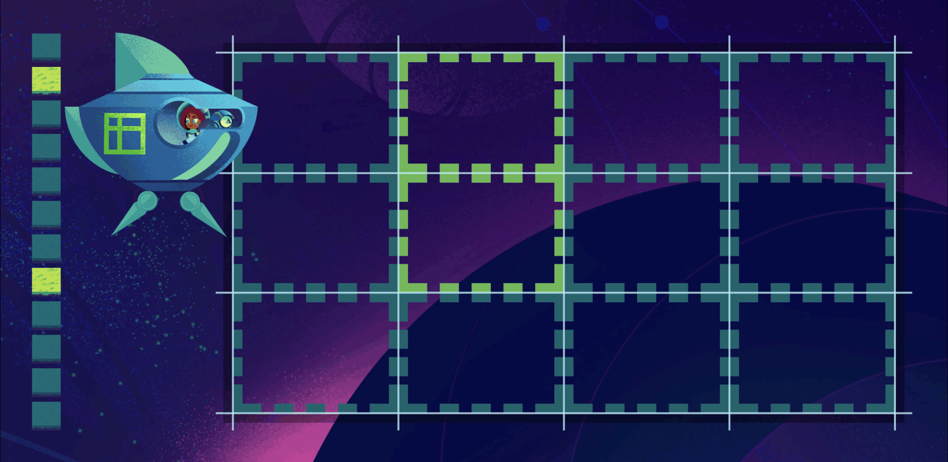
Grid items' default behavior of flowing into a Grid is called auto placement. The items fill up all the slots in the current row before moving on to fill the next row.
planet {
  grid-auto-flow: row; /* default */
}
You can change the grid-auto-flow property to column to make your Grid to fill up columns first:
  planet {
    grid-auto-flow: column;
  }

Placed Grid Items
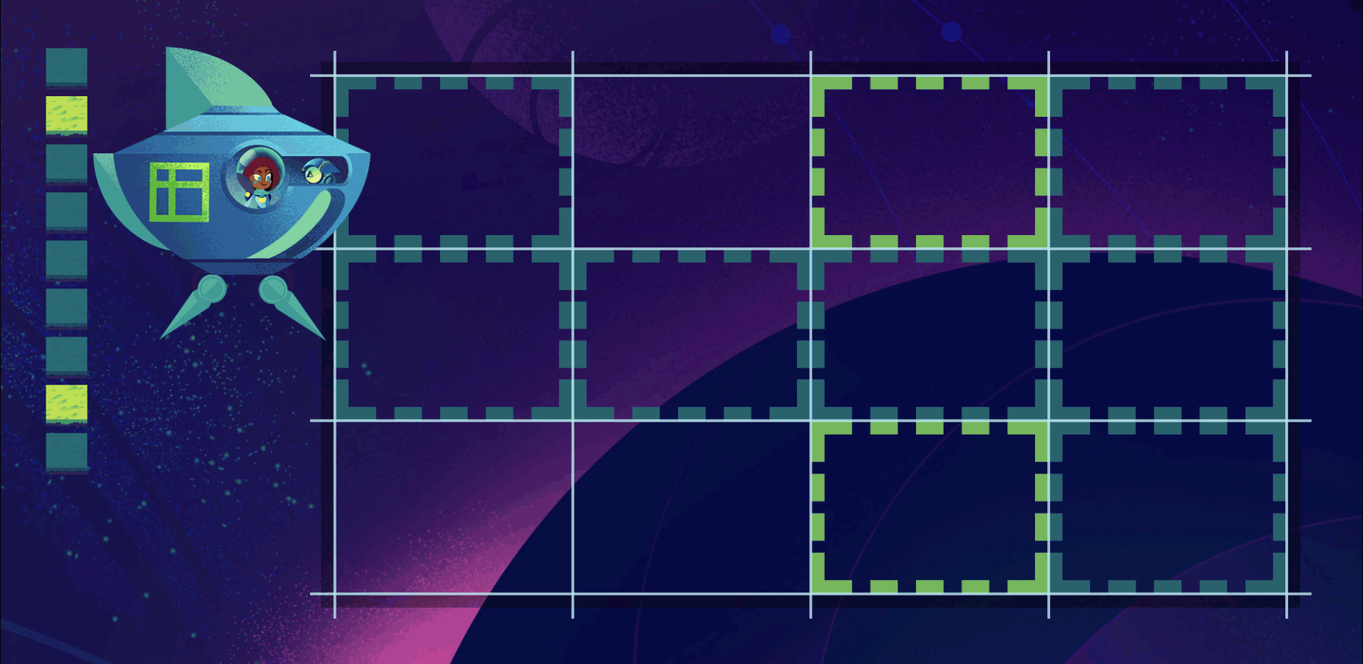
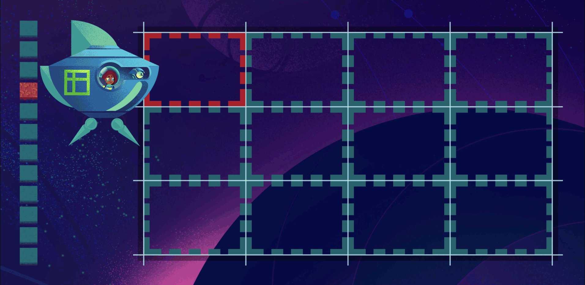
There are a ton of ways to place grid items in a grid, using the grid-row-start, grid-row-end, grid-column-start, grid-column-end, grid-row, grid-column, and grid-area properties. The Grid Item Placement algorithm gives top placement priority though to any item whose row start or row end is defined. In these examples I'll use a green rocky terrain for grid items that are being row-positioned and given priority placement.
row start
rocky {
  grid-row-start: 2;
}
These rocky terrains are number 3, 6, and 10 in the document (shown stacked to the left of the shuttle). But when they flow into the Grid, the browser places them first since they have a starting grid row specified. After they're in place, all the other items flow in around them.
row end
Items with an ending grid row are given equally high placement priority:
rocky {
  grid-row-end: 3;
}
row span
It's important to note that priority placement only happens for row start and end. You can make items taller by telling them to span multiple rows, but they'll still have to wait their turn to flow into the grid. When it's their turn, the browser makes them span two rows like they wanted, marking those cells as taken, causing future grid items to flow around them.
rocky {
  grid-row: span 2;
}
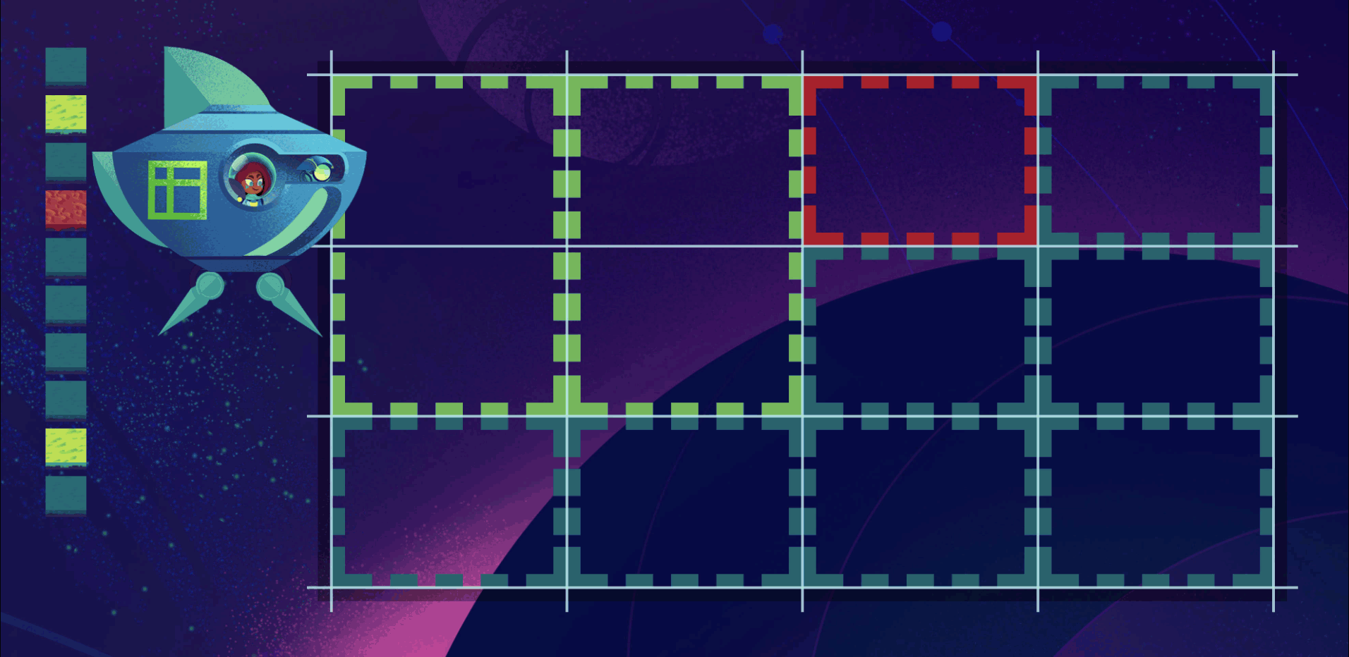
column positioning
You can position grid items to start/end in specific columns. Column positioning won't get priority placement, but when it's the item's turn the browser will honor the requested positions and skip to the specified column. This can leave empty cells in the grid which we'll talk about in a second.
rocky {
  grid-column-start: 3;
}
column flow priority
Remember how you can set your Grid to flow as columns instead of rows? When you do that, now column start/end is given top priority, and row start/end isn't.
rocky {
  grid-column-start: 3;
}
Let's boil this all down into something we can remember:
Order
You can change the order of grid items using the order property, overriding the default document order placement. Let's use some dunes to show the item whose order we're changing. Grid item order works exactly like Flexbox order, where items are order: 0 by default. Giving a grid item an order of 1 makes it show up at the end:
dunes {
  order: 1;
}
Even though the dunes item was fourth in the document order, it had to wait all the way until the end to get placed in the Grid. The spec calls this order-modified document order.
negative order
You can move grid items to the beginning by using a negative order, just like in Flexbox.
dunes {
  order: -1;
}
positioning before order
Ready for a twist? Order takes a backseat to row start/end positioning (or column start/end positioning in a column flowing Grid)
rocky {
  grid-row: 1 / 3;
}

dunes {
  order: -1;
}
Even though our dunes item had a negative order, the rocky items with row positioning got first dibs.
Items with that same-direction-as-grid positioning are Gold Card members and get to board first, no matter what. We can remember the priorities then with a simple rule:
2. order property
3. document order
Sparse vs Dense Grid Auto Flow
Going back to this example that left empty cells in our grid:
rocky {
  grid-column-start: 3;
}
sparse packing
Let's take a look at the journey of that first rocky terrain item. It doesn't have a row start or end specified, so it has to wait its turn. The browser starts from the first item in the DOM and works its way down. It places the first grass item in the first row, first column cell. Next item's turn. The browser sees that our rocky terrain wants to start in the 3rd column. So it skips forward to the 3rd column, sees that this slot isn't already taken, and drops our rocky item into it. Next item's turn. The browser moves to the next cell to the right rather than going back to the previous cell even though there's an empty space in it.
This behavior is called the sparse packing algorithm and is the default for a Grid:
planet {
  grid-auto-flow: row sparse; /* default */
}
dense packing
If we want the browser to go back and fill empty cells rather than leave gaps, we can change to the dense packing algorithm:
planet {
  grid-auto-flow: row dense;
}
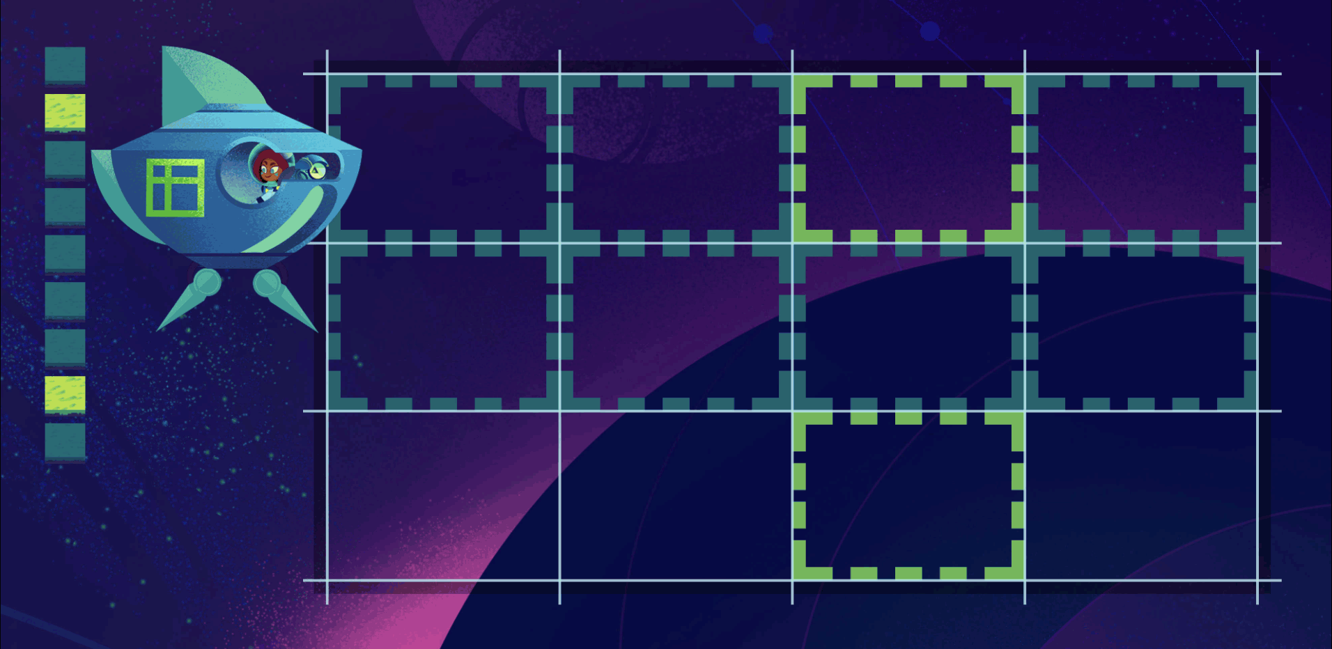
Now the browser will go back to previous empty cells as it moves along, dropping items into the first available slot that will fit the item. Notice our second rocky item's column positioning is still honored.
Master Grid Layout
Grid layout is mind-blowing. It will change the way you code. Once you have it down you'll use it everywhere.
To get there you're going to need to know all of the properties and their options like the back of your hand. You'll need to internalize how Grids work. There are a ton of concepts you'll need to fully understand. But mastery is absolutely worth it.
I built Grid Critters to give you mastery of all of it. By playing the ten chapters you'll gain intuition. You'll be able to simply build awesome UIs without having to think or struggle or look things up.
Master CSS Grid right from the start by playing this new mastery game. You'll learn the ins and outs of Grids one fun level at a time, while saving an adorable alien life form from certain destruction.Master CSS Grid