
Breakdown: New Grid Critters Site
When I first came up with the idea for a CSS Grid Mastery Game, I had no idea whether people would dig it enough to pay real cash monies for it. I didn't want to waste too much time or energy building a fancy website for my game, just in case it was a flop. I took maybe a day or so and slapped together this ugly little text wall and called it good:
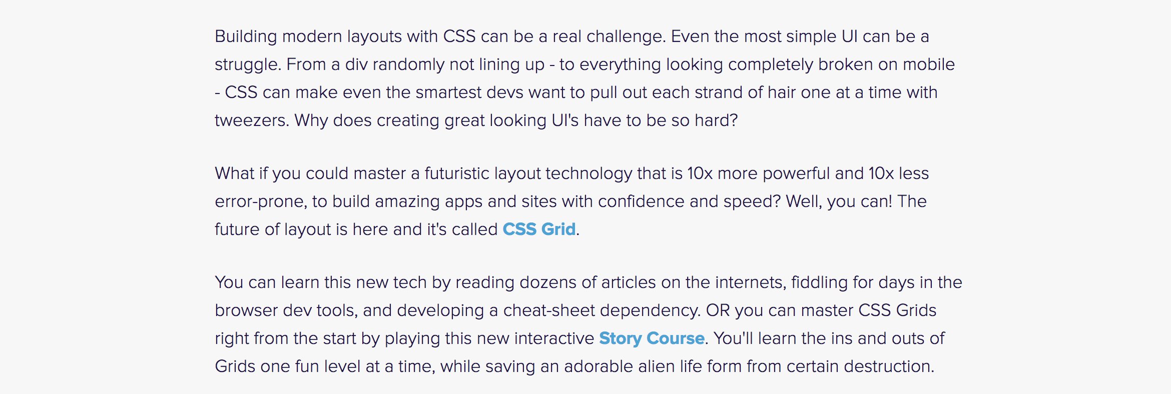
I made around \$30k from sales at launch. This gave me enough runway — and more importantly enough hope — to keep going. I couldn't believe how awesome people were. I had no choice but to do a gratitude project to express my thanks. And still... I didn't update my crappy website.
A few weeks ago I decided it was finally time to make the site look as cool as the game it represented. I want to share with you the breakdown of how I built this site with CSS Grid, some of the cool UI things I did on this site, and some lessons learned. I'll be building a similar layout in flexbox for the new Flexbox Zombies site in the future so you can see how the two layout tools compare.
Here's the brand new site gridcritters.com if you want to check out the final result.
Grids FTW
I used CSS Grid everywhere for this site, and it was awesome. The first three sections are contained in a two-column, three row grid. Here's how I divided it up:
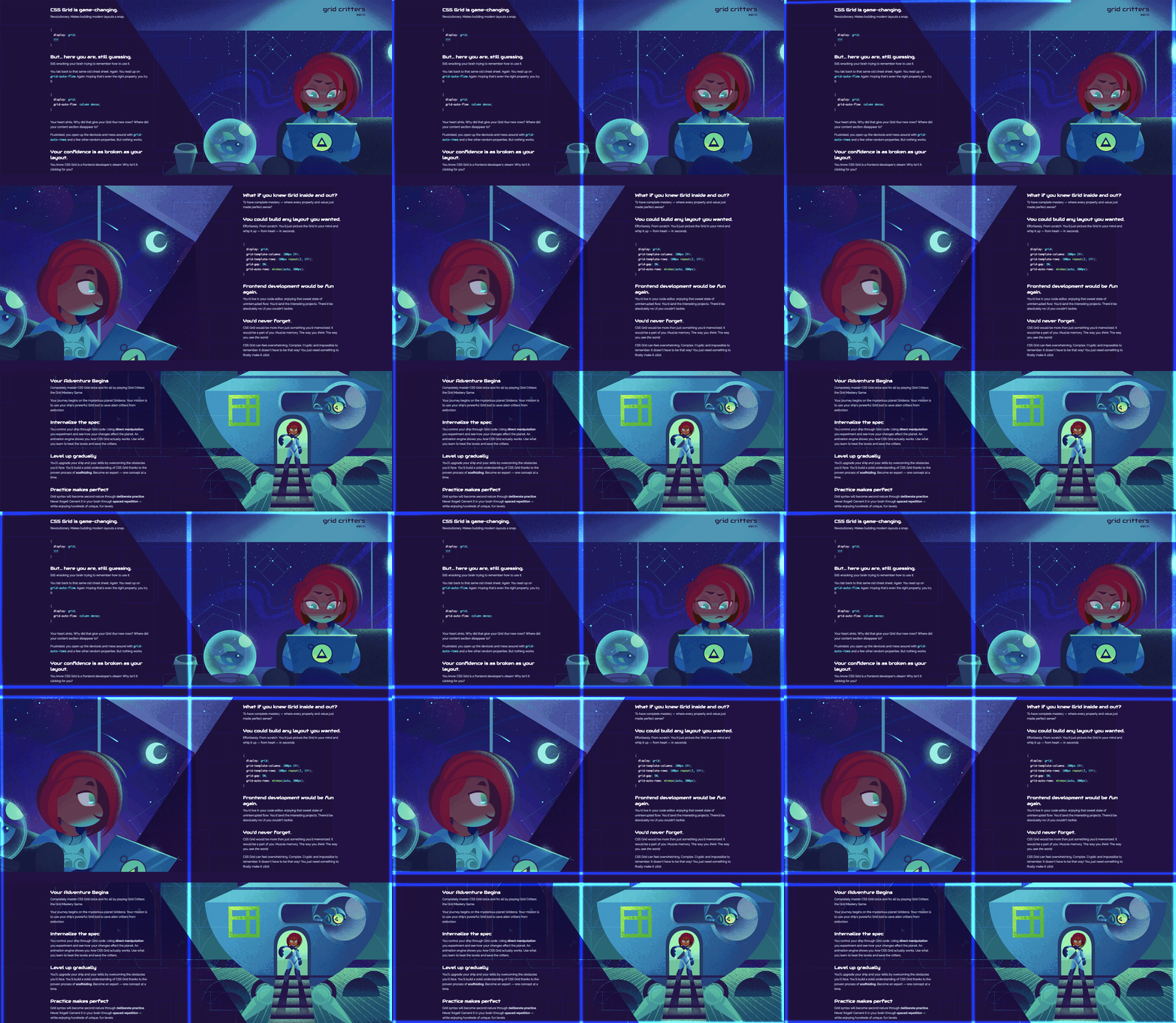
The code looks like this:
.intro {
  display: grid;
  grid-template-columns: 1fr 1fr;
  grid-row-gap: 3.2em;
}
I split it into two equal sized columns (the new fr unit is so freaking great). I didn't bother defining my three rows though, I just let the grid create them implicitly — which grids do whenever they have more content than cells or when spanning/positioning items outside the defined grid. The default size for implicit tracks is auto, which means it will match the size of the track's content.
So in this grid I get three auto sized rows for free without having to even define them. Always good to know those defaults! The grid-row-gap puts a bit of spacing between the rows, but not on the top or bottom edges of the grid which is exactly what I wanted here. Gaps are awesome, definitely one of my favorite new tools that CSS Grid gives us.
Centered, Readable Text
I positioned my text into one of the fr columns. The default behavior of text in a Grid cell is justify-items: stretch. This makes the text stretch out as big as the column it's in. So my text started by taking up half of the screen:
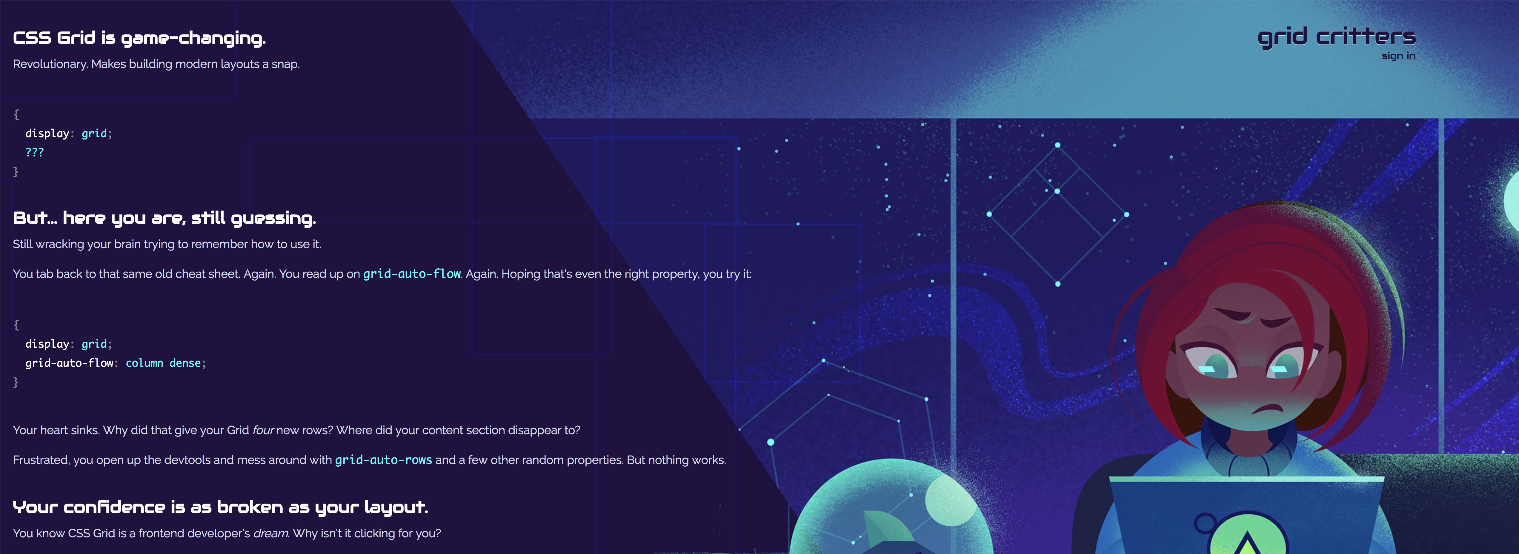
Text that wide is hard to read, so I gave the text a max-width: 50ch to limit each line to roughly twelve to fifeteen words. But now something interesting happens: the text is no longer as wide as the 1fr grid cell it's living in. And stretch doesn't apply to items that have an explicit width. What ends up happening then is that the text shows up way over on the left:
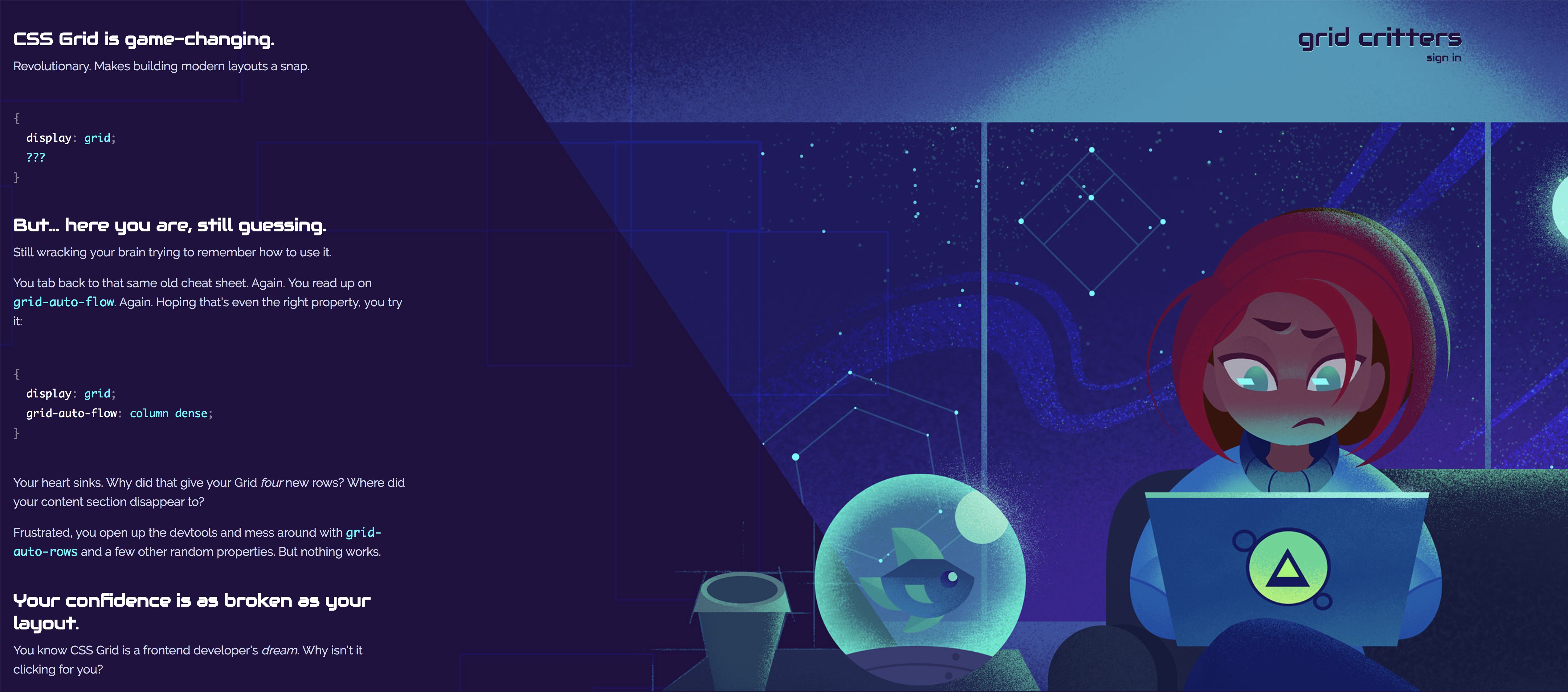
All we have to do then is center the text relative to its grid column:
.text {
  justify-self: center;
}
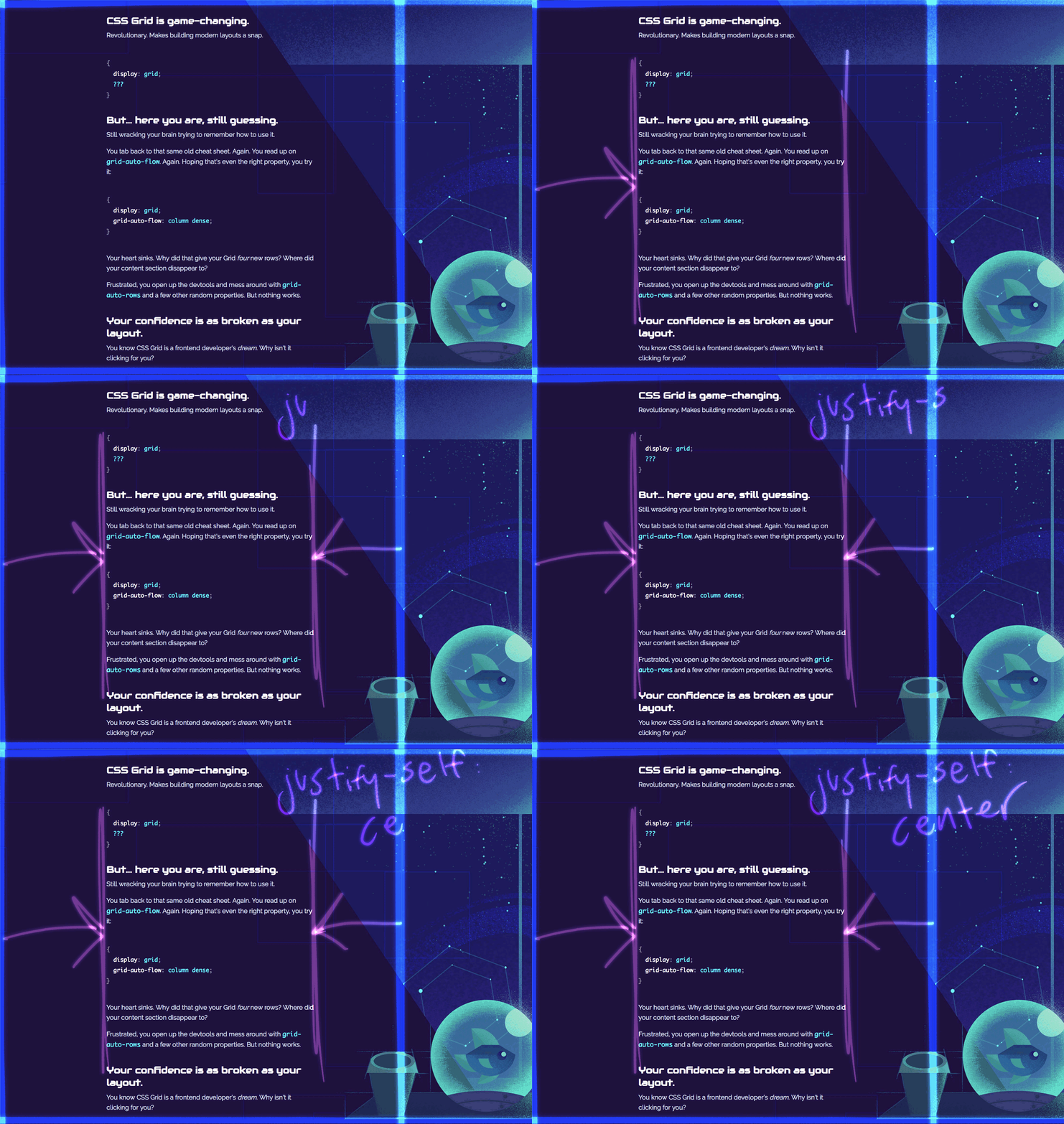
And there we have it! Readable text centered perfectly in its grid column.
Background Illustrations
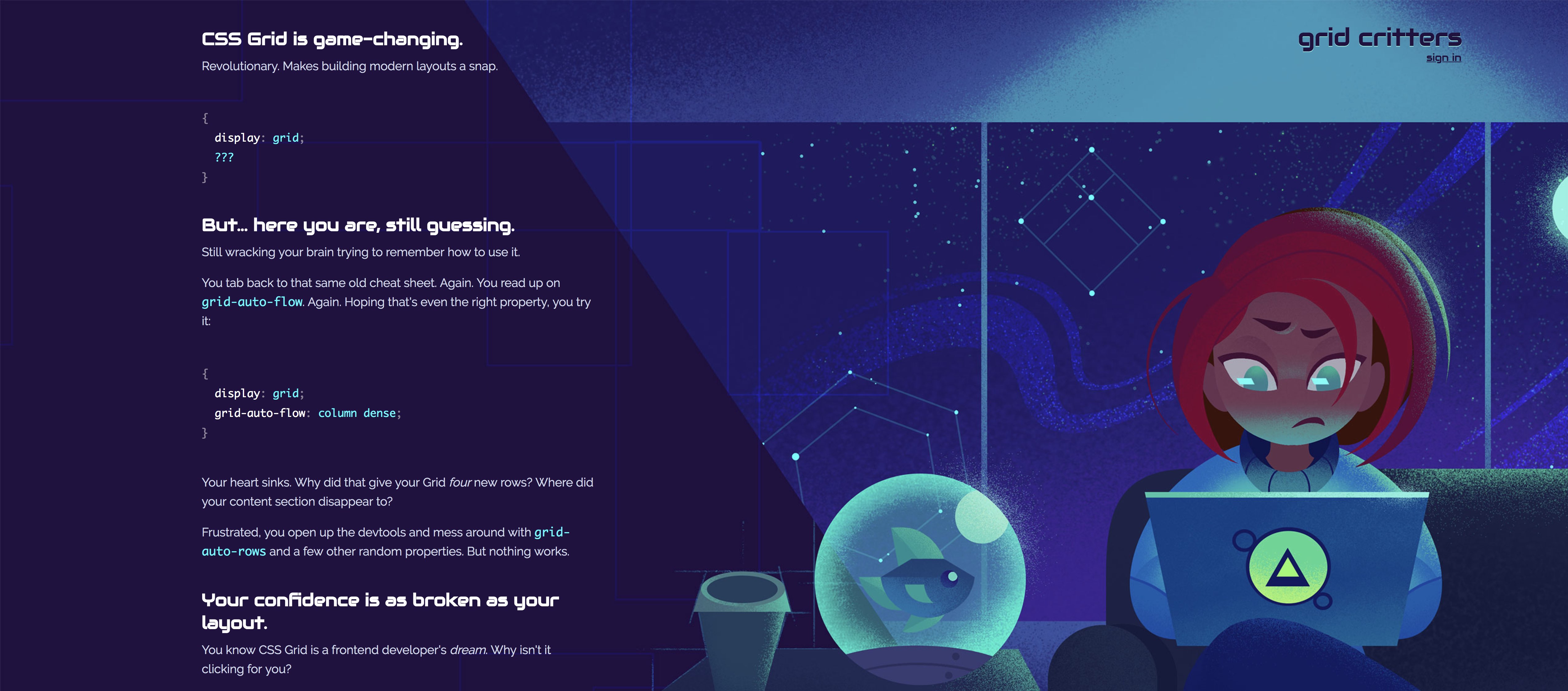
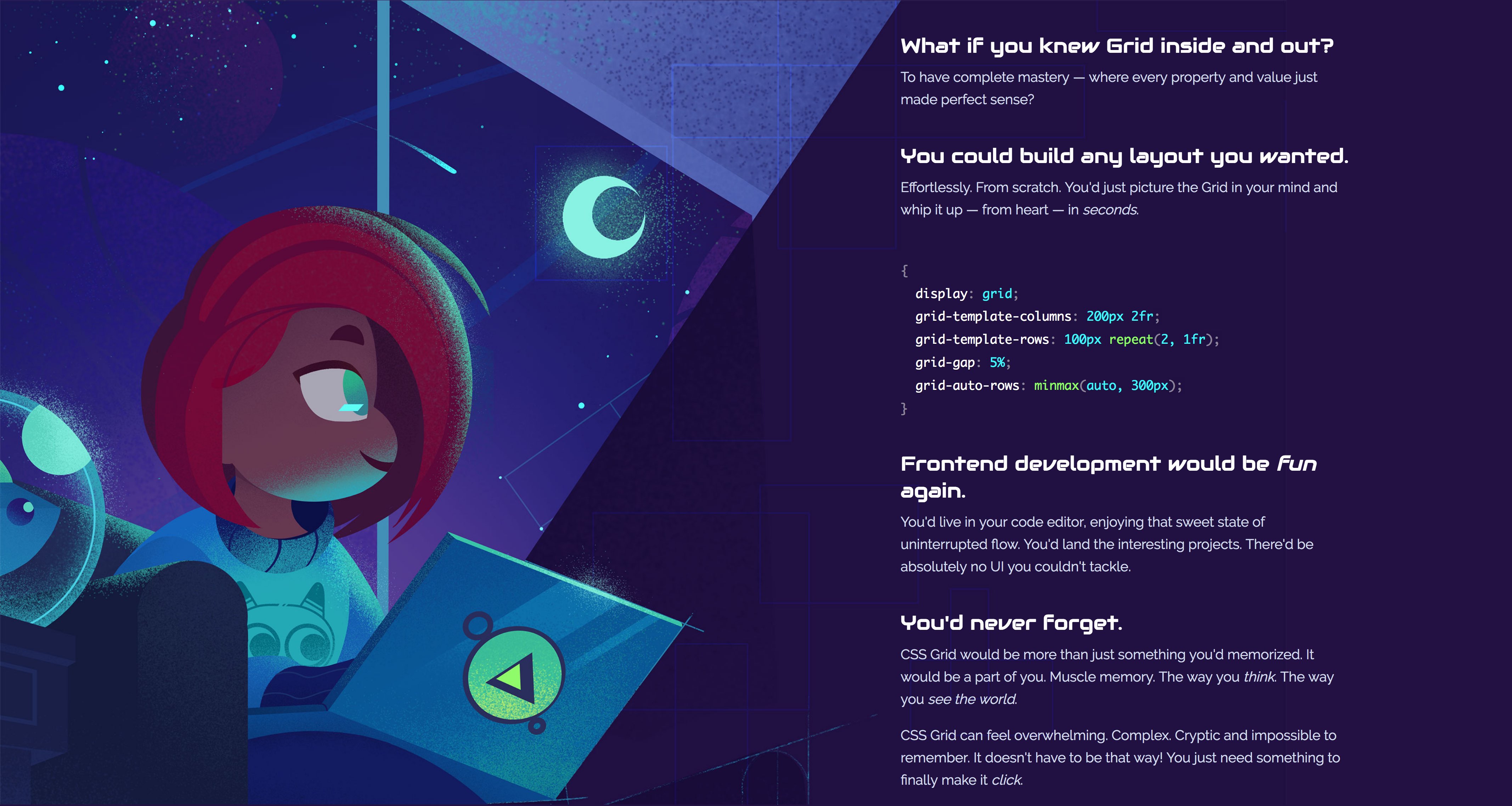
These illustrations show the game's main character Meg as an everyday coder, struggling with CSS like we all have. I wanted parts of these images to overlap into the text areas, allowing just a bit of those faint grid line patterns to shine through.
By default grid items take up just one cell each. But a cool trick that's especially useful for background images is to position them into the same cell as other grid items. I used grid-area to make these images take up both columns of the grid.
.master-it-pic {
  grid-area: 2 / 1 / 3 / 3;
}
This code means: start at row 2, column 1. End at row 3, column 3. In other words, take up the entire second row of this grid. grid-area is just a shorthand for positioning items by grid lines, using either numbers like I did here or by named grid lines.
The result of overlapping the illustration grid item and the text grid item is a really nice, less boxy effect:
SVG Level Previews
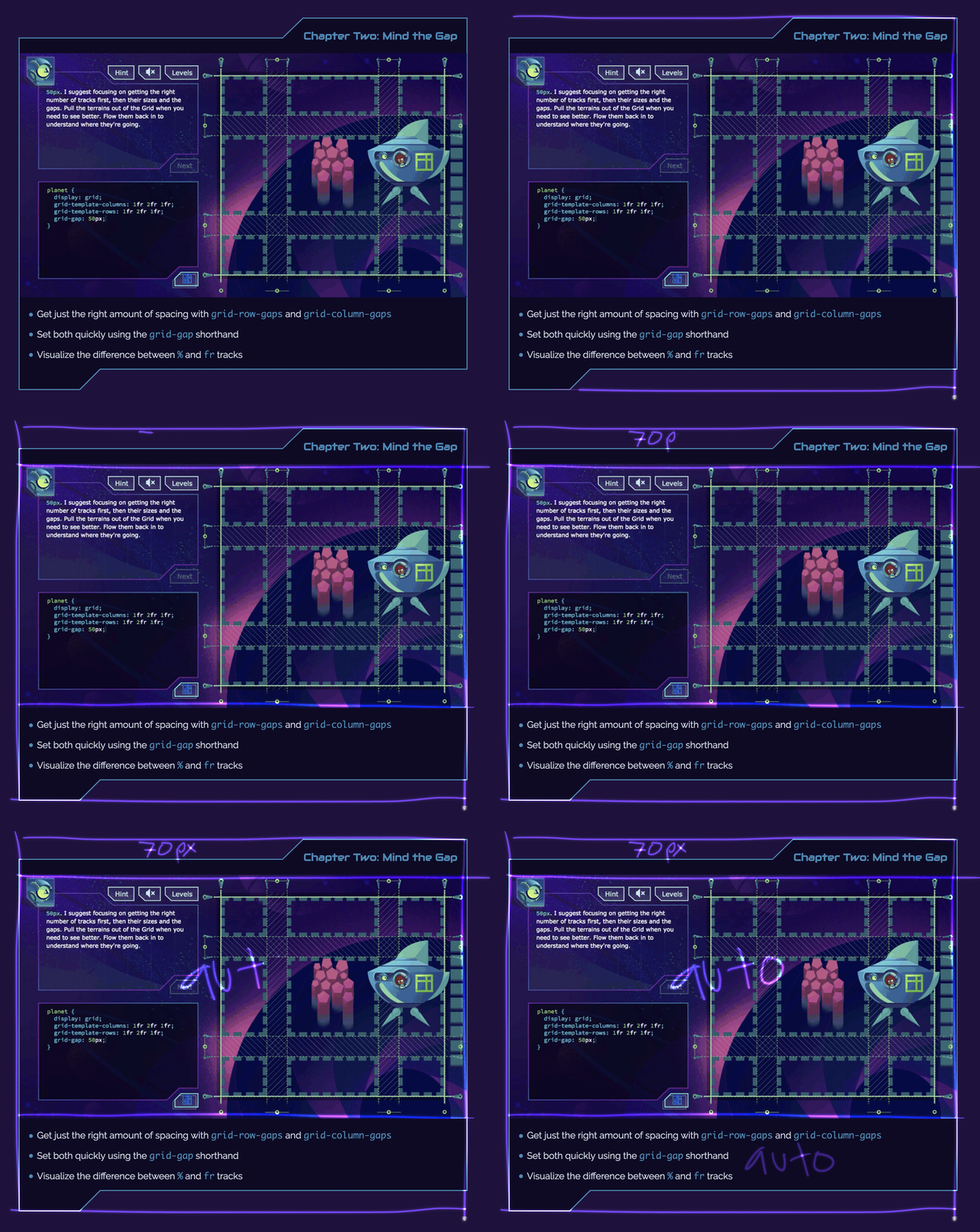
The next part of the page is a preview of each of the chapters. For these I made a short screencast of me playing that level. I then exported them as animated gifs but they were giant, like 10mb each. Turns out browsers simply can't handle that many giant gifs at a time, much less the network delay fetching such massive files. I converted them to .mp4 videos instead and that made them way smaller and better performing.
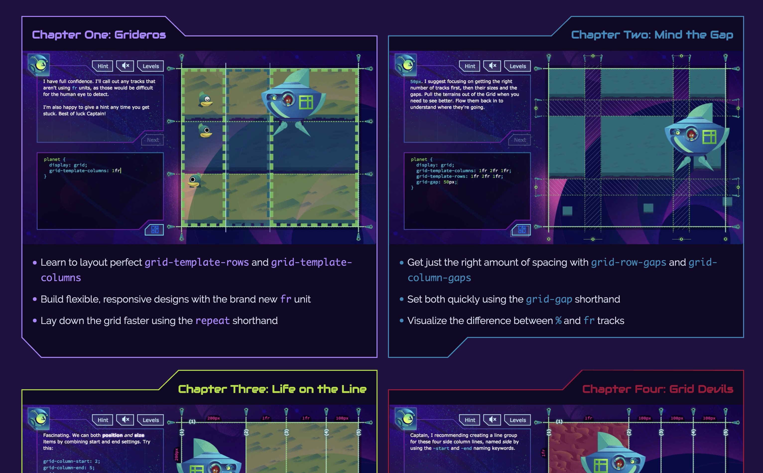
To create those fun crazy-shaped futuristic outlines I used the same dynamic SVG technique that I used in the game itself.
These previews are themselves a CSS Grid.
.chapter {
  display: grid;
  grid-template-rows: 70px auto auto;
}
Using auto for the last two rows let them scale to the size of their content.
Responsive Grid
Here's another thing the CSS spec peeps really nailed this time around. Grid really is perfect for responsive layout. When the browser is less than 1220px I simply change the grid positioning of my text items so that they occupy both columns and a row under their illustration instead of by its side:
.master-it {
  grid-column: 1 / 3;
  grid-row: 4;
}
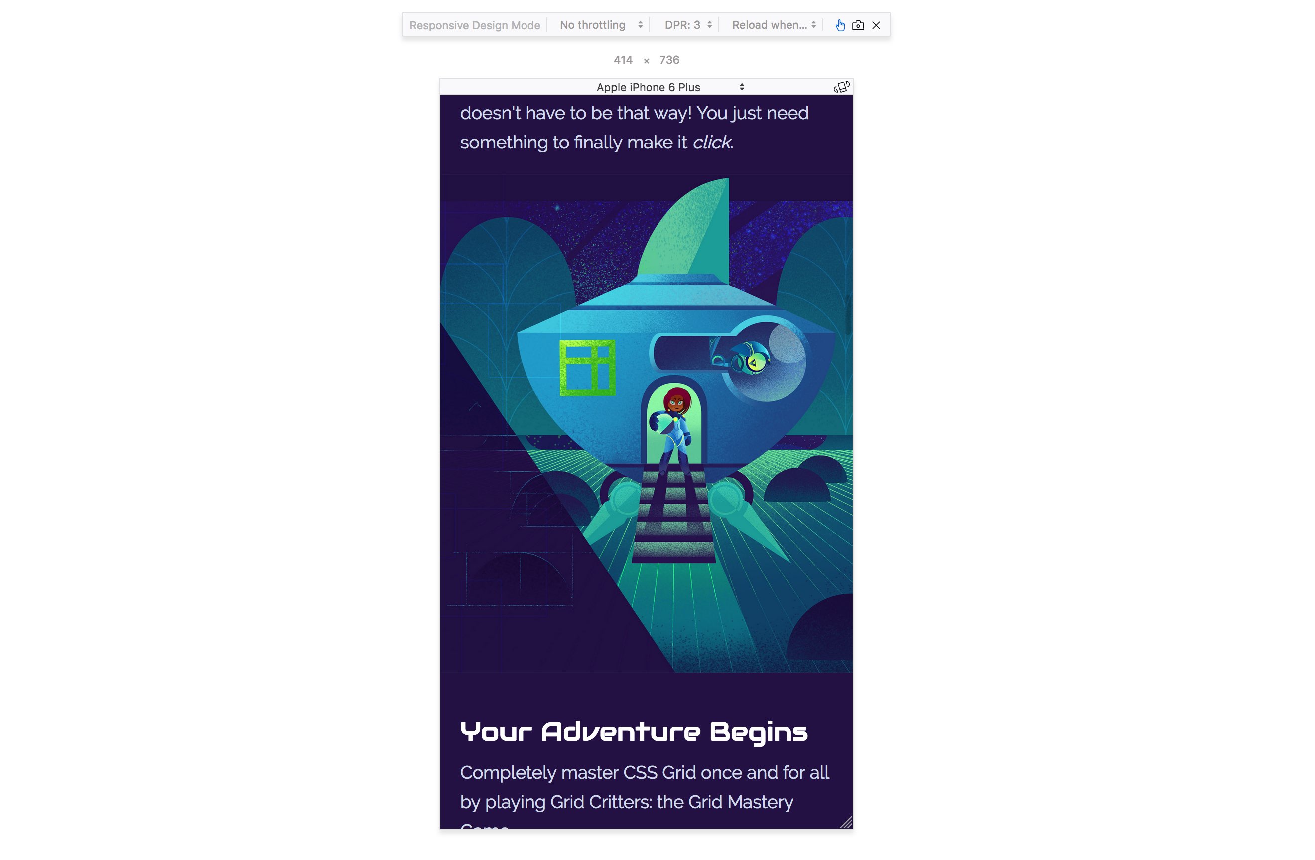
This makes the site appear as single column for mobile. Looking back named grid areas probably would have been a better approach for this, as I would have only had to update the single grid-template-areas property inside the media queries.
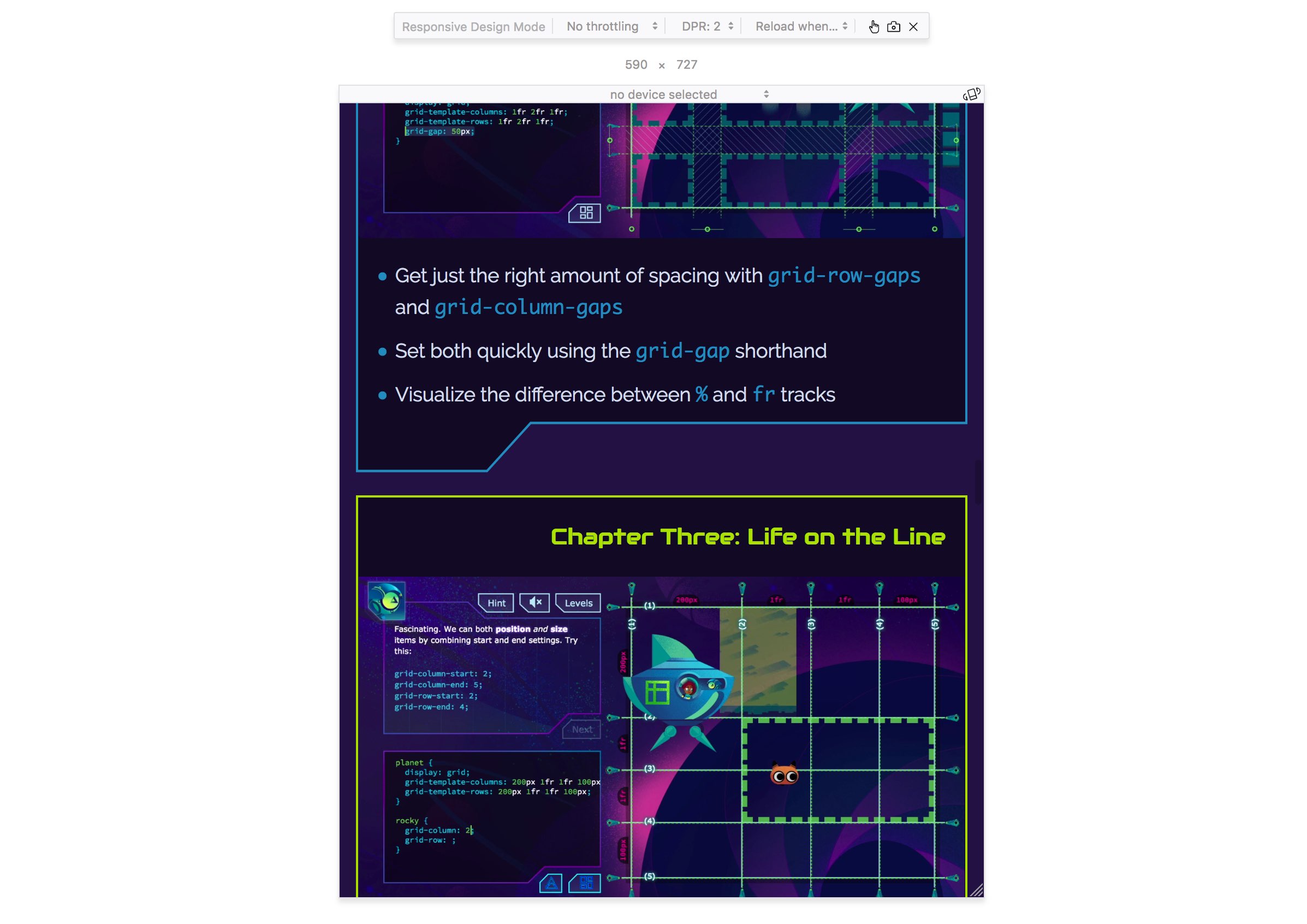
The futuristic SVG border tops didn't look too good on mobile, so I scaled them vertically with a CSS transform, which chopped off the top part. Then I gave it a solid border to complete the shape again only flat, which looked a lot better on small browsers.
.chapter svg {
  transform-origin: bottom center;
  transform: scaleY(1.1);
  overflow: hidden;
  border-top: 2px solid;
}
Lessons Learned
- After shipping my new site I saw significant boost in sales. Turns out a good-looking site is super important :)
- I had to scrap some early designs because I did them without first having my actual content written. Content first is still a very good rule to follow.
- I started building this site desktop first, then halfway through changed my media queries to start with mobile size and work up to desktop. mobile first is still the way to go.
- giant gifs are bad, videos are way better
- I discovered that it's still possible to make videos autoplay on iOS, the secret is to make sure the videos have no audio, they use the "autoplay" attribute, and the "playsinline" attribute. Otherwise iOS just shows a picture instead of playing the video.
- CSS Grid is amazing not just for apps but for websites as well.
Challenge
Build a nice little CSS Grid website for your side project. Potential users will think more highly of your project, and you'll learn a bunch while you're at it.
Master CSS Grid right from the start by playing this new mastery game. You'll learn the ins and outs of Grids one fun level at a time, while saving an adorable alien life form from certain destruction.Master CSS Grid