
Dynamic SVG Components
Bored of boxes? This is a neat little trick I discovered recently that adds some spice to a UI. By combining the modern component mindset with some of that untapped SVG power and modern fluid layouts we can create incredibly flexible UI components that really shine. Here's how!
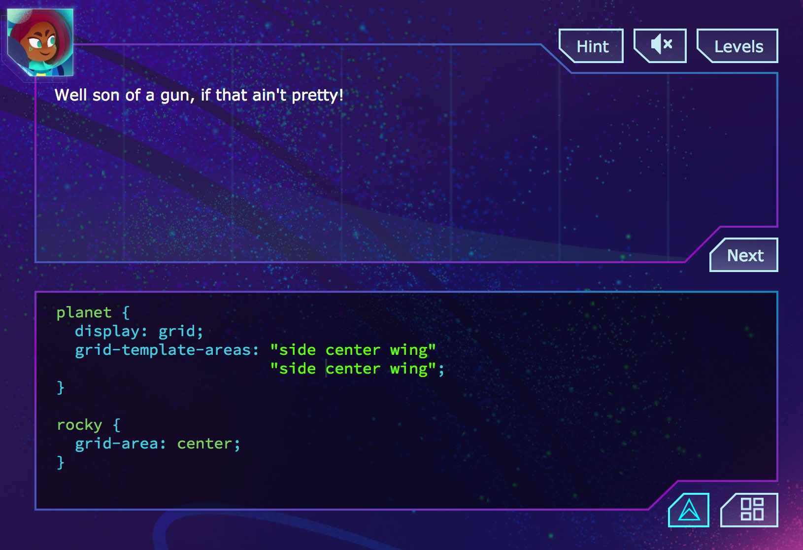
So I wanted to make these Panel components for Grid Critters that had this cut-corner sci-fi look:
I wanted them to be flexible: growing and shrinking with the size of the CSS Grid cells they lived in. But I also wanted to preserve those cool sharp angles, no matter the size of the component. Essentially I needed to scale most of the SVG, while keeping parts of it a fixed size. I figured it out and the effect is pretty sweet. Watch how the angled parts are always the same size and snugly fit the buttons, while the rest of the panel scales with the available space:
Let me show you how I did it so you can create your own awesome dynamic SVG components.
Start with Basic SVG
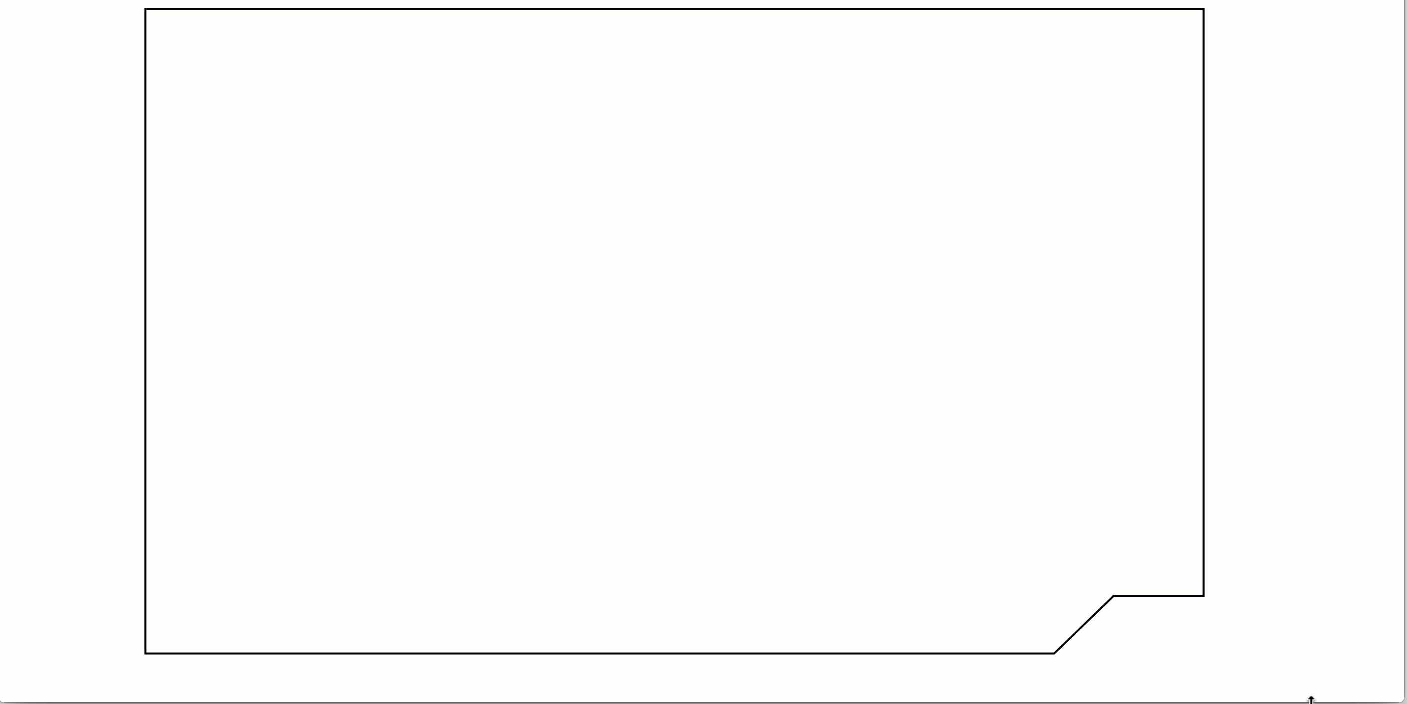
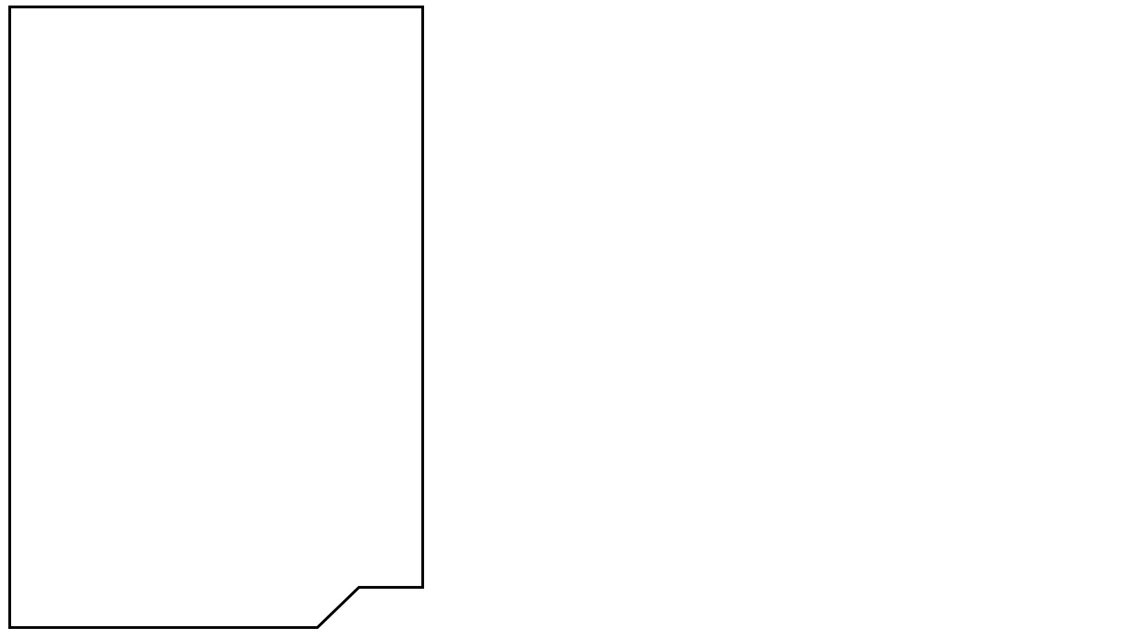
The first step is to create the shape you want in SVG. I exported my design straight from Sketch and removed the extra attributes/junk Sketch outputs:
<svg viewBox="0 0 540 340">
  <g stroke="black" fill="none" strokeWidth="2">
    <path d="M539,1 L1,1 L1,329 L463,329 L493,300 L539,300 Z" />
  </g>
</svg>
This paints a basic shape, as defined in the path's d attribute.
Change SVG Defaults
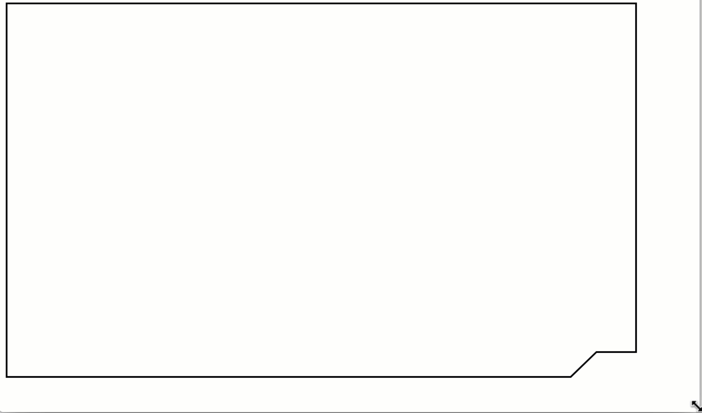
By default SVG already has the ability to scale the entire vector:
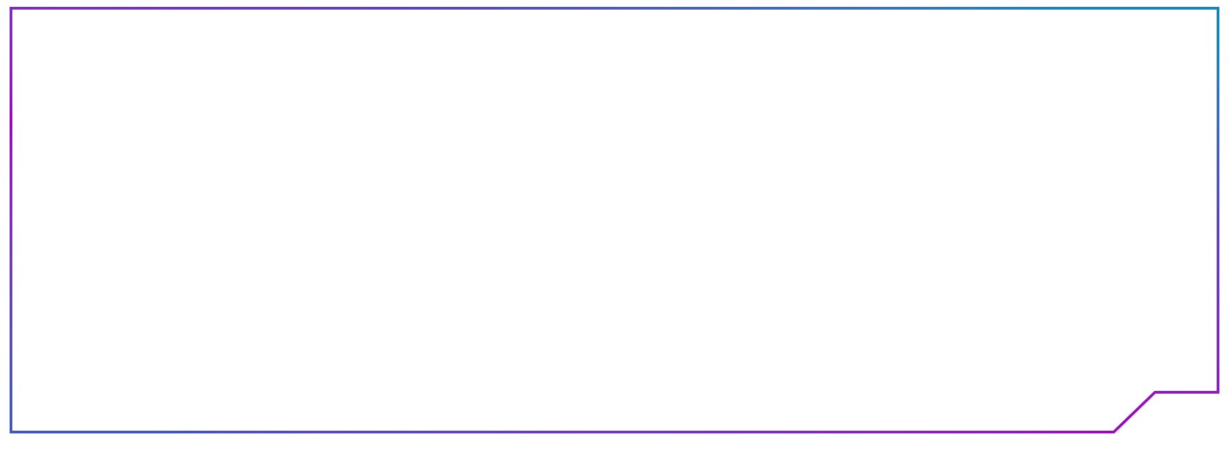
Notice how the stroke is scaling along with the vector? That's cool but we want the stroke to stay a constant size regardless of vector scale. We can change this by setting the path's vectorEffect to non-scaling-stroke:
<path
  vectorEffect="non-scaling-stroke"
  d="M539,1 L1,1 L1,329 L463,329 L493,300 L539,300 Z" />
Now the vector still scales but the stroke stays the same size:
Componentize It
Next up turn the SVG into an actual component so you can make it highly configurable. I'm using React but you can use Vue or whatever you like.
import React from "react";

const styles = {
  position: "absolute"
};

export default class Panel extends React.Component {

  render() {
    const strokeSize = 2;

    return (
      <svg
        style={styles}
        viewBox="0 0 540 340"
      >
        <g
          stroke="black"
          strokeWidth={strokeSize}
          fill="none"
        >
          <path
            vectorEffect="non-scaling-stroke"
            d={this.props.path}
          />
        </g>
      </svg>
    );
  }
}
Once it's a component you can reuse and customize it with parameters. In this case I'm passing it the path coordinates to draw when it gets rendered:
import React from 'react';
import Panel from 'Panel';

export default () => {

  const path = `
    M539,1
    L1,1
    L1,329
    L463,329
    L493,300
    L539,300
    Z
  `;

  return (
    <Panel path={path} />
  )
}
This SVG component can now be used in many ways, drawing any path we pass it.
Make it Boundary Based
Now that we have a component, let's make it size itself based on how much space it has available. So rather than using fixed coordinates, we'll make the path draw relative to the size of its bounds. Initially let's just define some arbitrary bounds of 540px by 350px. I like using template literals for things like this, to conveniently generate the path string.
const bounds = {
  width: 540,
  height: 350
}

const stroke = 1;

const path = `
  M${bounds.width - stroke},${stroke}
  L${stroke},${stroke}
  L${stroke},${bounds.height - stroke}
  L${bounds.width - 77},${bounds.height - stroke}
  L${bounds.width - 47},${bounds.height - 30}
  L${bounds.width - stroke},${bounds.height - 30}
  Z`;


return (
  <div>
    <Panel bounds={bounds} path={path} />
  </div>
)
SVG path syntax is a bit strange, so I've annotated where each point corresponds to the shape, starting in the top right corner. They key here is that each coordinate point be calculated relative to the bounds. I'm also subtracting the stroke size from all the coordinates touching edges since SVG draws its strokes on the outside of the path and there's no way to make it draw on them on the inside.
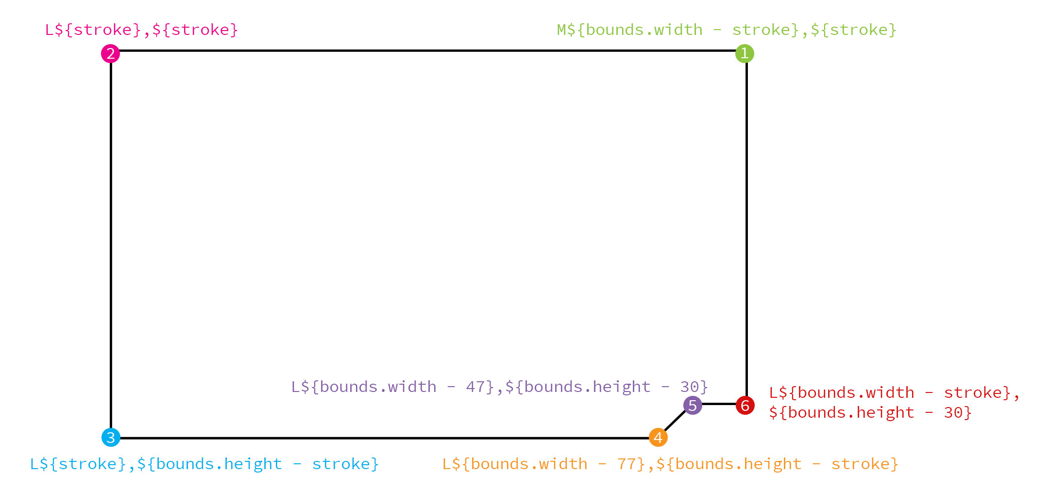
The last point is the letter Z which tells the path to close by going back to the first point in the top right corner.
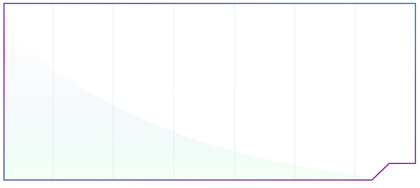
The numbers you see correlate to distance from the edges of the bounds. Let's zoom in on the sharp angled corner and take a look.
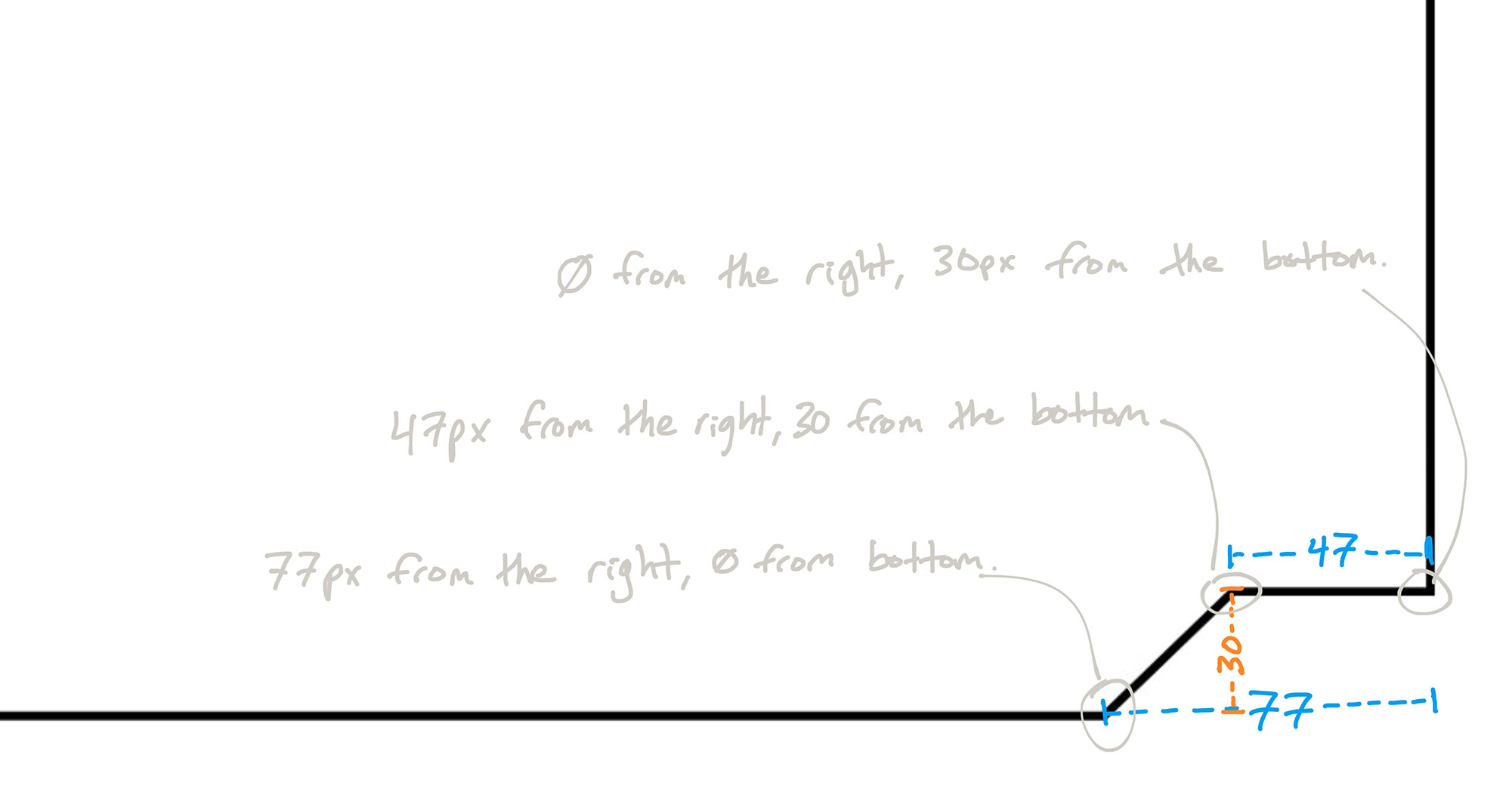
Using points relative to the bounds is how we make the component stretch in some places (e.g. top left corner to bottom left corner), and stay fixed in other places (e.g. 77px from the right).
It's also important that your SVG object's viewBox be set to the same size as your bounds. This ensures that the SVG uses the same coordinate system as the DOM. The easiest way is to just pass the bounds as another parameter to the component and set it on the SVG:
<svg viewBox={`0 0 ${bounds.width} ${bounds.height}`} >
  ...
</svg>
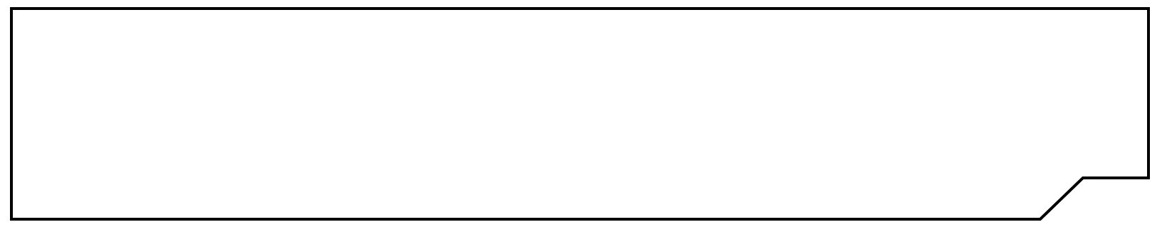
There! Now our SVG component path is bounds-based and we can change its size simply by changing its bounds! We can make it short and wide:
const bounds = {
  width: 800,
  height: 150
}
Or we can make it tall and narrow:
const bounds = {
  width: 300,
  height: 450
}
No matter the size of the bounds, the panel scales in both directions perfectly and keeps the sci-fi corner angle unchanged.
Make it Container Based
Now that our component draws its lines based on given bounds, we want to calculate those bounds automatically. There are a lot of ways to accomplish this, but my favorite is a little goodie I shamelessly stole from the brilliant React developer iammerrick. The solution is a React component named MeasureAndRender (feel free to check out the src code) that measures the size of its DOM element, and makes those measurements available to its children. It also re-renders with freshly calculated bounds whenever the window is resized.
Let's use this MeasureAndRender component instead of hard-coding the bounds:
<MeasureAndRender stretch={true} debounce={1}>
  {bounds => {

    const path = `
      M${bounds.width - stroke},${stroke}
      L${stroke},${stroke}
      L${stroke},${bounds.height - stroke}
      L${bounds.width - 77},${bounds.height - stroke}
      L${bounds.width - 47},${bounds.height - 30}
      L${bounds.width - stroke},${bounds.height - 30}
      Z`;

    return <Panel bounds={bounds} path={path} />
  }}
</MeasureAndRender>
Sweet! Now the SVG component's bounds are calculated automatically, and it stretches to fit beautifully.
Make it Pretty
Just for fun let's replace that boring black stroke with a cool gradient:
<linearGradient
  x1="11.8748878%"
  y1="100%"
  x2="88.1251154%"
  y2="0%"
  id="linearGradient-1"
>
  <stop stopColor="#4656B8" offset="0%" />
  <stop stopColor="#9C02BA" offset="39.9%" />
  <stop stopColor="#5A44BA" offset="74.2%" />
  <stop stopColor="#1485B8" offset="100%" />
</linearGradient>
And finally let's give the whole thing a nice little "space glass" looking background:
<pattern
  id="panel-background"
  patternUnits="userSpaceOnUse"
  width="100%"
  height="100%"
>
  <image
    xlinkHref={`https://gedd.ski/img/chat-panel.png`}
    preserveAspectRatio="none"
    x="0"
    y="0"
    opacity=".4"
    width="100%"
    height="100%"
  />
</pattern>
And there you have it! A gorgeous dynamic SVG component that can be reused, configured, and added to. Because it's dynamic it fits perfectly in a fluid Grid. Because it's configurable it can be used to create all kinds of interesting instances:
Thanks for reading. Here's the final source code for you to experiment with. Now take what you've learned and go build your own dynamic SVG components! Have fun and as always, I look forward to seeing your creations.
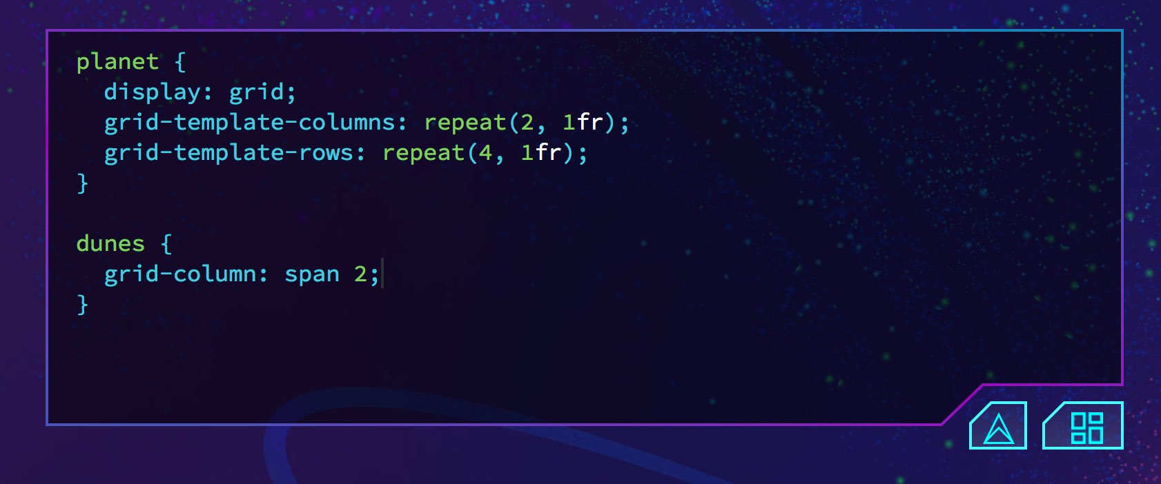
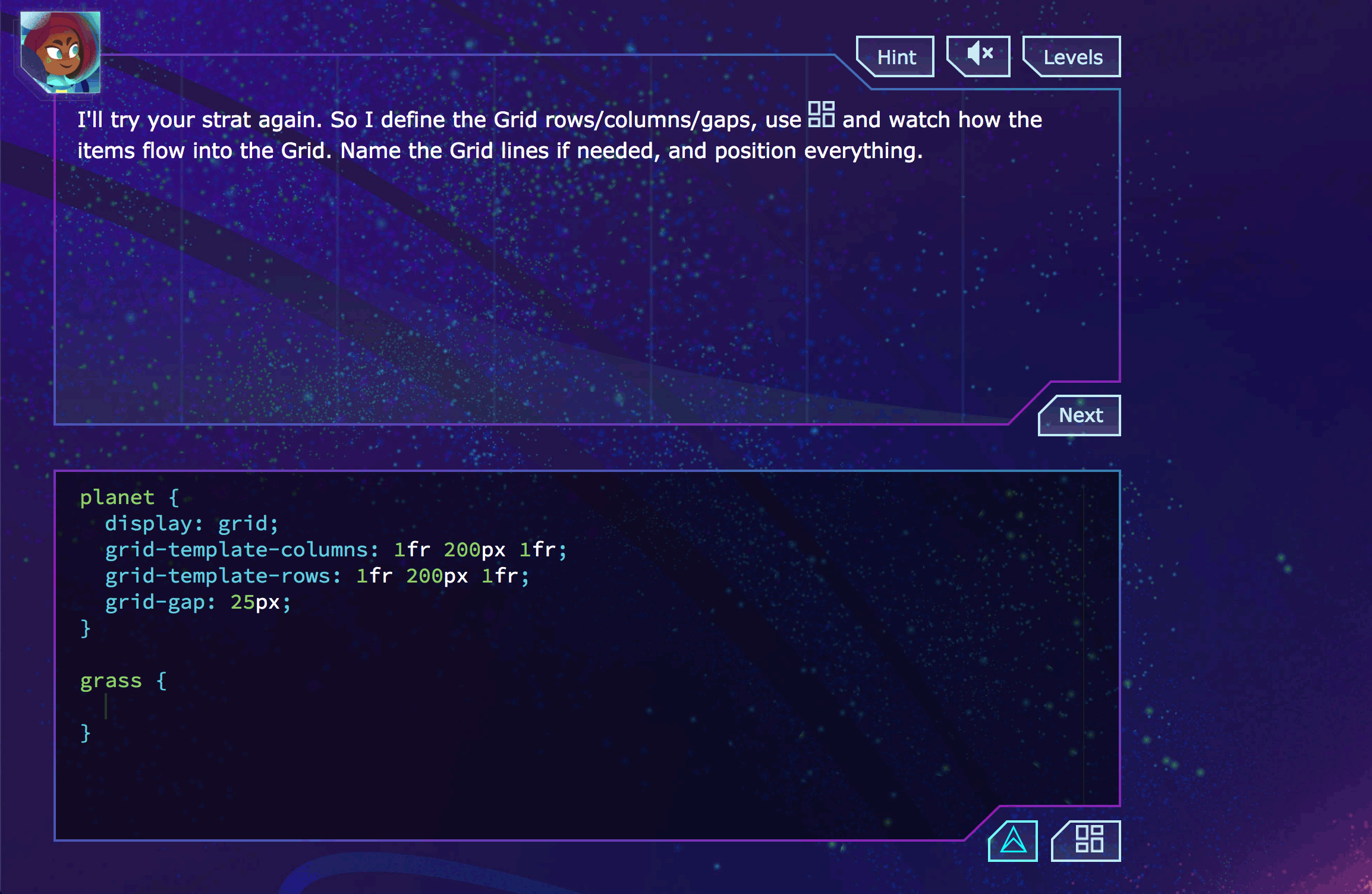
Master CSS Grid right from the start by playing this new mastery game. You'll learn the ins and outs of Grids one fun level at a time, while saving an adorable alien life form from certain destruction.Master CSS Grid