Building an Invisible Grid
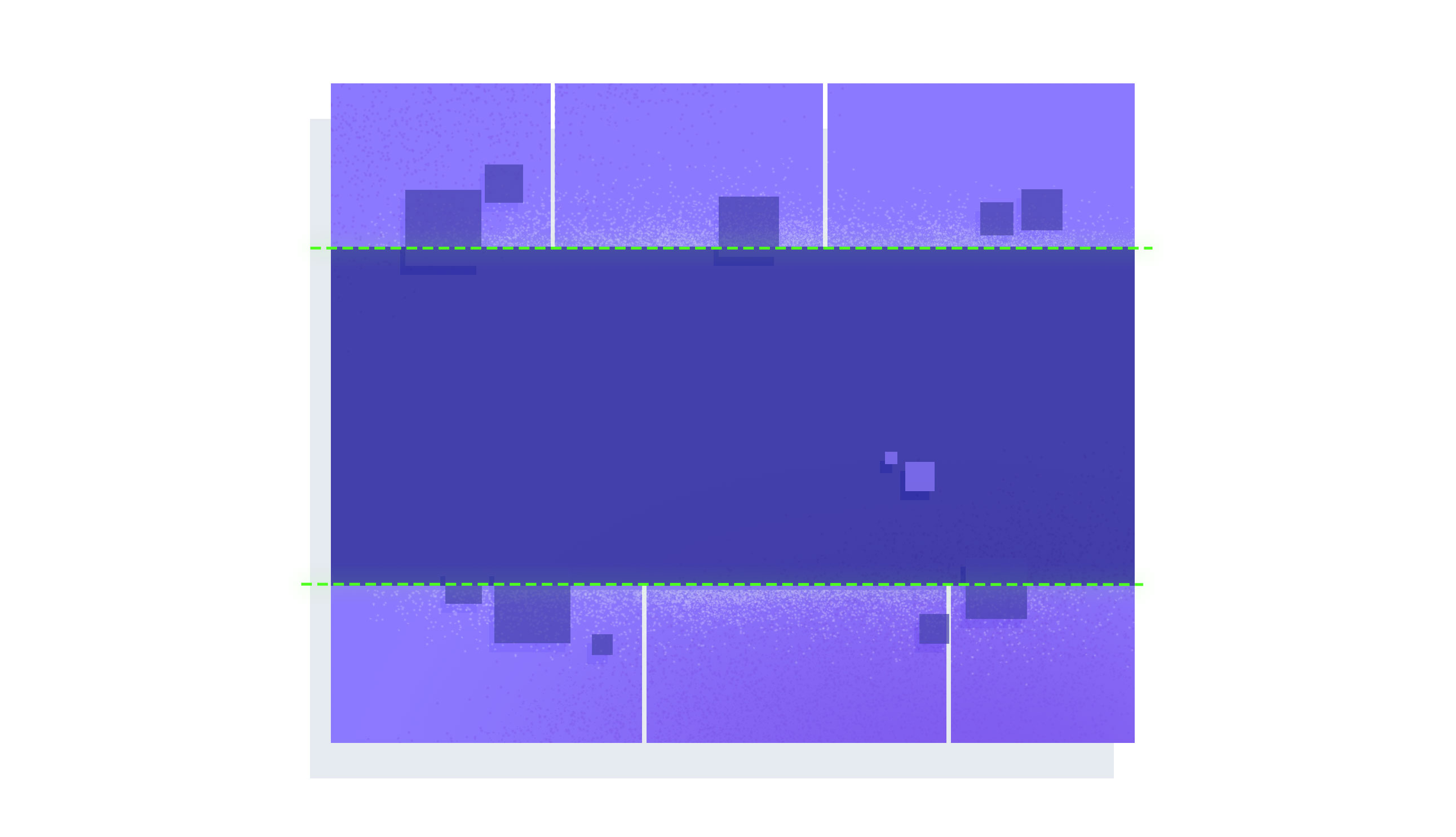
This is what a 12 column, 6 row CSS Grid looks like:

Compare that with a 5 column, 4 row Grid:

Uhh... they look the same. And empty. Where are the columns and rows?
Grids are the future of UI - they're perfect for responsive and full page layouts. But there's one slight catch: you can't actually see them.
Remember the story of Rapunzel? The prince excitedly climbed the tall tower to see his beloved Rapunzel, only to find the wicked witch in her place. The prince was so shocked and frightened that he fell off the tower into some thorns, which of course blinded him because that's what thorns do to princes' eyes.
You're the prince in this story. You've found your true love of layout (CSS Grid), but the wicked witch (spec writers?) have made it so you can't see your new sweetheart.
We're not at all used to working in the dark like this. We've always been able to style everything: floated divs, absolute positioned spans, even table rows & columns. But not Grids. A Grid only lets us see the content that goes inside of it, not the Grid itself. But as it turns out, being able to visualize your Grid while you build it is pretty important!
See the Grid
The clever folks at Mozilla realized that building layouts in the dark was going to be a real struggle. So they built an amazing tool into Firefox called the Grid Inspector.
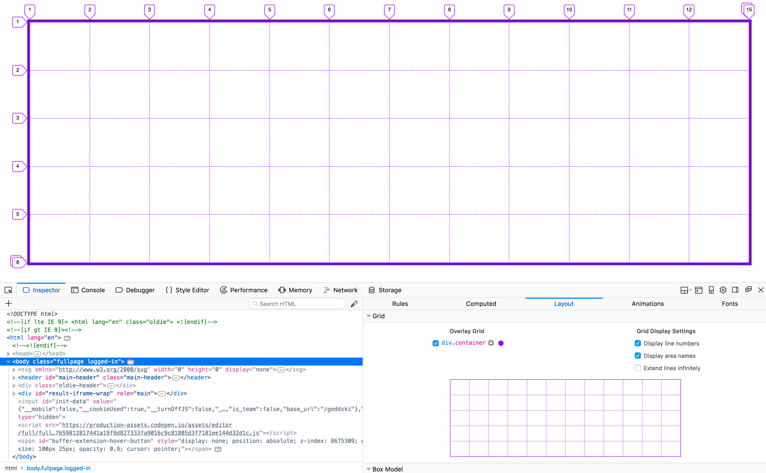
Here's what our first 12 column, 6 row Grid looks like as visualized by the Firefox Grid Inspector.

This tool allows us to "see" the grid by rendering lines in the same positions as our Grid Lines. It also renders any grid gaps and grid areas you've defined.
Check out this 30 second clip where I used this awesome tool to visualize Link's inventory Grid in the Zelda UI.
It would have been next to impossible to get such an accurate Grid without being able to see it.
Get Them Tears
After falling from the tower, the prince searched blindly for his lost love. At last he heard Rapunzel's voice and was reunited with her. While holding him she cried, and her tears fell into his eyes. Naturally, this restored his sight and everything was just perfect.
Don't try to build things blind. Let Firefox cry into your blind eyes so you can finally see your Grids and build amazing UIs - happily ever after.
Update: Chrome 62 just got a very basic Grid highlighter that shows up when you hover over the element in the dev tools. It's not nearly as good as the full inspector in Firefox, but is a decent start.
In my next post I'll show you how to build your own custom Grid Inspector as a fun side project and to help you better understand how this awesome new tool works.

Master CSS Grid right from the start by playing this new mastery game. You'll learn the ins and outs of Grids one fun level at a time, while saving an adorable alien life form from certain destruction.Master CSS Grid