CSS Grid Beats Flexbox for Full Page Layout
Ahh that sweet moment when you and your new app have your first style together:
.app {
}
But now what? Should you build your app's main container layout using Grid or Flexbox?
Honestly you could pull it off with either. But the new CSS Grid layout has some big advantages over Flexbox when it comes to building a full page layout. Let's take a look.
Control In Both Directions
With Flexbox you have to choose which way your flex container flows: up, down, left or right. Your flex items are placed into the flex container until there's no more room for them all, and then based on their flex-basis will either shrink, overflow, or wrap. You can mimic a two-dimensional layout using flex-wrap, but you don't have nearly as much control over the lines as Grid gives you. You also run into problems with getting the correct spacing for items on the last line since each flex line behaves as its own separate flex container for spacing and alignment.
Grid layout gives you a lot more power and control. Here's an example that creates a Grid of two equal sized columns, a 100px header and footer, and flexible space in the middle. With just a couple line of CSS we're able to tell the blue item to take up two columns, and the purple item to take up two rows:
.container {
  display: grid;
  height: 400px;
  grid-template-columns: 1fr 1fr;
  grid-template-rows: 100px 1fr 100px;
}

.purple {
  grid-row: span 2;
}

.blue {
  grid-column: span 2;
}
Once you get the hang of Grids, two dimensional layouts like this are a snap.
Flexbox Takes More Rules, Divs, Work
The example above could have been built with Flexbox, but it would require a lot more to make it happen.
What the heck, let's build the example again in Flexbox just to see the difference:
.container {
  outline: 5px solid black;
  display: flex;
  flex-direction: column;
  width: 500px;
  height: 400px;
}

.top{
  display: flex;
  flex-direction: row;
  flex-grow: 1;
}

.bottom {
  display: flex;
  flex-direction: column;
}

.left {
  width: 50%;
  display: flex;
  flex-direction: column;
}

.right {
  width: 50%;
  display: flex;
}

.grey {
  flex-basis: 100px;
}

.blue {
  flex-basis: 100px;
}

.orange, .purple, .blue {
  flex-grow: 1;
}
We got it, but not without adding four extra divs, 5 extra style rules, and having to use 5 flex containers (with varying directions) as opposed to just 1 grid container.
Start With a Grid
CSS Grid layout was designed for this kind of thing, and it shows. These days it makes a lot of sense to start new apps & full page layouts with a Grid. Here are a couple Happy Little Divs videos that show how well Grid works for the Zelda UI and the Overwatch UI.
If you want to become a master of Grid layout check out my Grid Critters Mastery Game.
Challenge
Start building that side project idea you've been meaning to do forever, using the brand new CSS Grid layout.
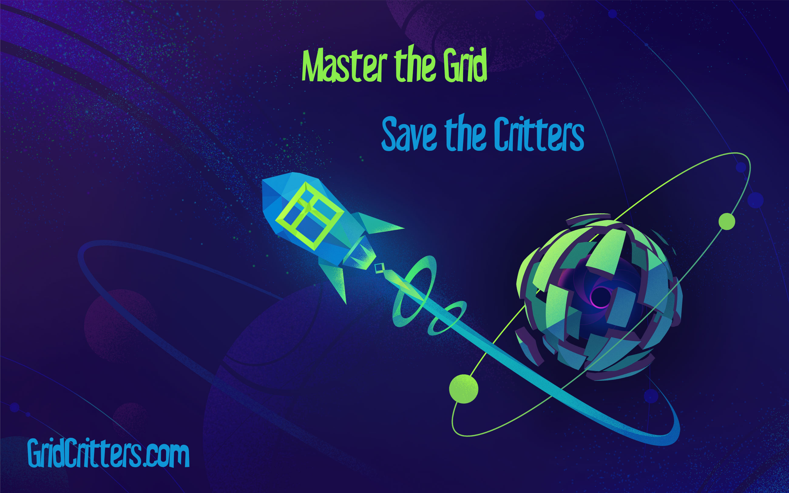
Master CSS Grid right from the start by playing this new mastery game. You'll learn the ins and outs of Grids one fun level at a time, while saving an adorable alien life form from certain destruction.Master CSS Grid