
Polish Makes Perfect
Your work is undoubtedly awesome. You're proud of it. But deep down you know it could be so much better. You struggle to know how to take your craft to the next level.
The good news is you don't need a degree in Human Computer Interaction or to have been born with some magic designer DNA. You can practice the art of polish and develop the ability to create highly polished work.
What you polish should be heavily influenced by your user's feedback, or you may polish something nobody even cares about.
When you polish needs to take place at very specific times or you may ship junk or worse — never ship at all.
How to Polish
You have an enormous blind spot. As a developer you've spent hundreds of hours thinking about and working on your project. Your main obstacle isn't a lack of skill or a shortage of time, it's an abundance of familiarity.
As developers we quickly become blind to the lame parts of our apps. We acclimate faster than a sheep grows thick wool in the bitter winter. We get used to the confusing menus, UI glitches, and fragile user interactions we've written.
The way to combat acclimation is to practice self-awareness. Regularly ask yourself these questions:
- What have I gotten used to?
- What workarounds have I been doing, that could trip up someone using this for the first time?
- How can I completely eliminate the need for these workarounds?
It's a constant process. Bake it into your routine/schedule/sprint. The little things add up. And you'll get better at it the more you practice.
Polish Examples
That's the principle, now I want to show you some practical examples of how my team and I polish — using Service Workies as an example. My games are certainly not perfect, but with every bit of polish they get better and better. We grab a handful of small polish tasks every week as we work. Polish is part of every release. But after shipping chapter two we set out to do a dedicated round of polish.
Dialogue Positioning
One of the things I wanted to polish in this game over Grid Critters and Flexbox Zombies was the dialogue placement. In both of those games the dialogue had a fixed position docked to one side of the screen:
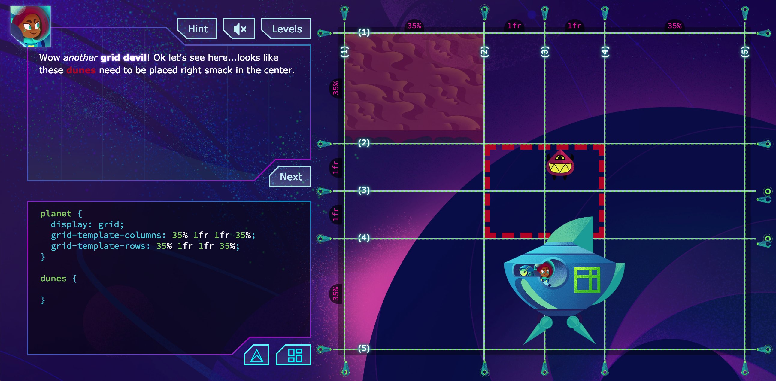
This pattern came up in user feedback — people often spent the majority of their time looking at the left side of the screen: either reading dialogue or typing code. They'd sometimes miss the helpful visualizations. A lot of games do this for dialogue (probably because it's easy), but I wanted to try for better this time. So in Service Workies the dialogue is positioned above characters' heads as they speak:
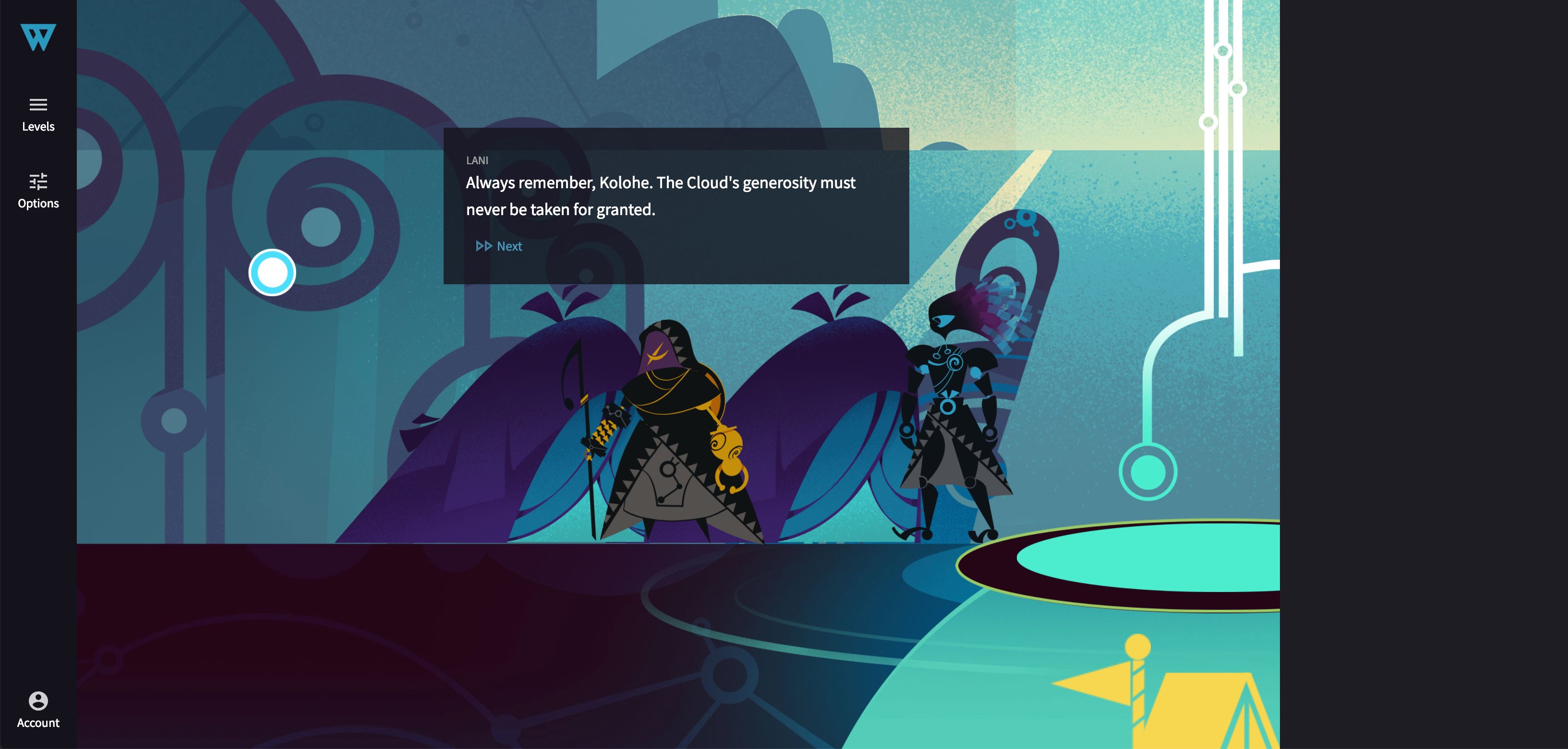
This made the experience that much more immersive. But it also created a problem: sometimes the dialogue would cover up important game elements:
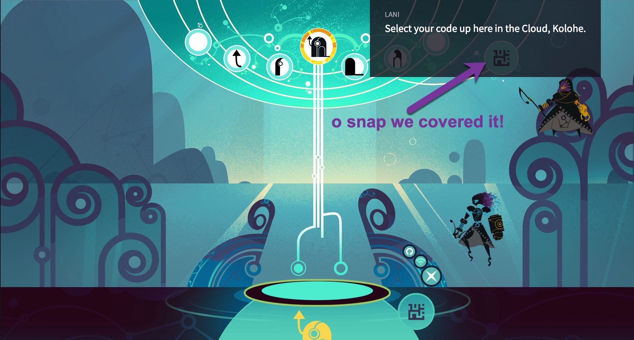
My "quick fix" was to make the dialogue element not emit click events using CSS pointer-events: none. So users can just click through the dialogue element to the underlying game canvas. It worked and I got used to it. But in hindsight this is a super lame experience.
After an internal battle on the subject of shipping quickly vs being lazy, I went back to the drawing board on dialogue positioning. I explored a few ideas like "slots" where dialogue could be guaranteed to not cover anything. But this game has so many characters & beasts that can all move around on screen, there was no such lucky quick fix.
That's when my teamie/brother Jonathan came up with this brilliant idea: a smart positioning system based on simulated annealing (inspired by the process of liquid cooling/crystallizing to solid). Each game object is given a penalty score for being covered, and the dialogue is given a handful of attempts to figure out the most ideal position (lowest penalty score) as it "cools" into place.
The whole process is nearly instant and only renders once. But so that you can see it in action here it is artificially throttled and forcing a re-render on each calculation. Check it out:
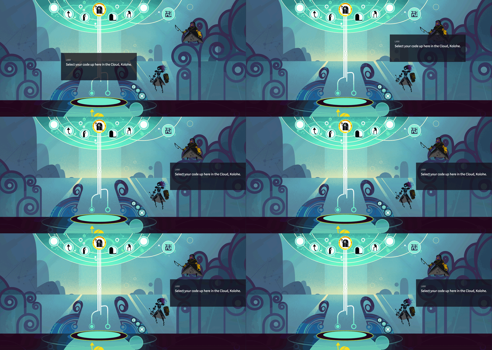
The dialogue element now lands in the perfect position without covering anything up!
Code Sidebar
The game has a code panel that players use to practice writing Service Worker code.
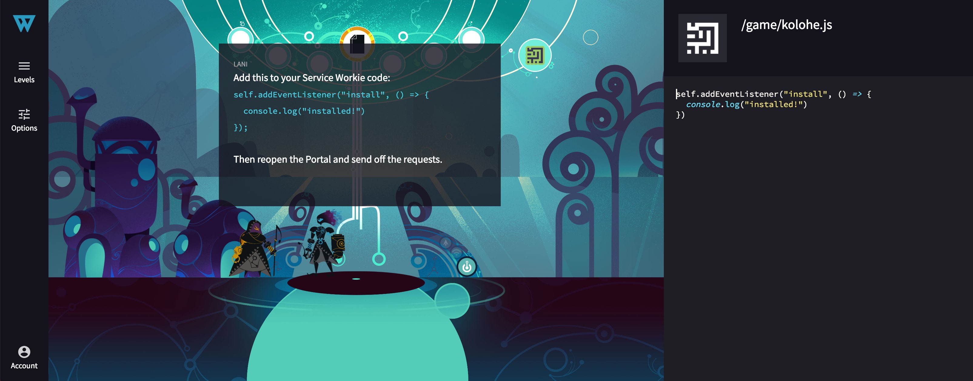
It looks pretty nice if you're on a large external monitor like I'm used to working on. But on laptops or smaller screens it forces the game to shrink to tiny, unplayable sizes:
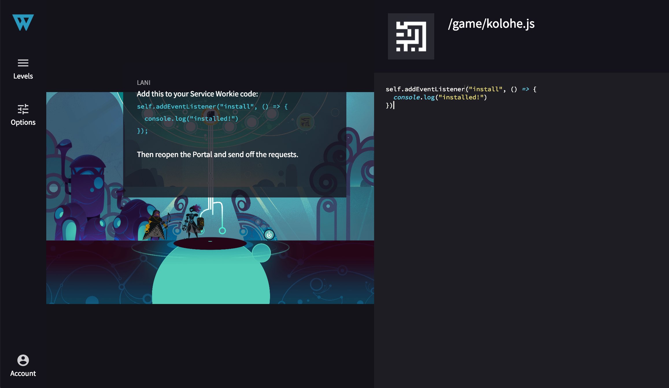
Not to mention wastes a ton of space when the code panel isn't being used.
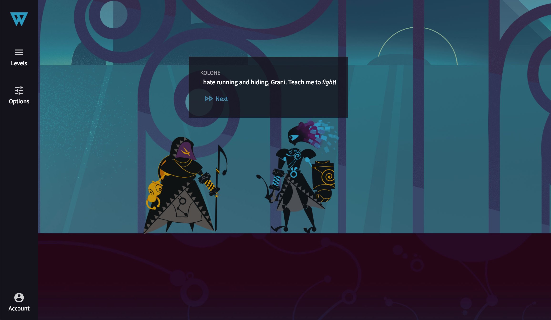
The polish for this one was to dock the code panel off screen until needed, giving full space for the story elements of the game:
And sliding the code panel in whenever it's needed:
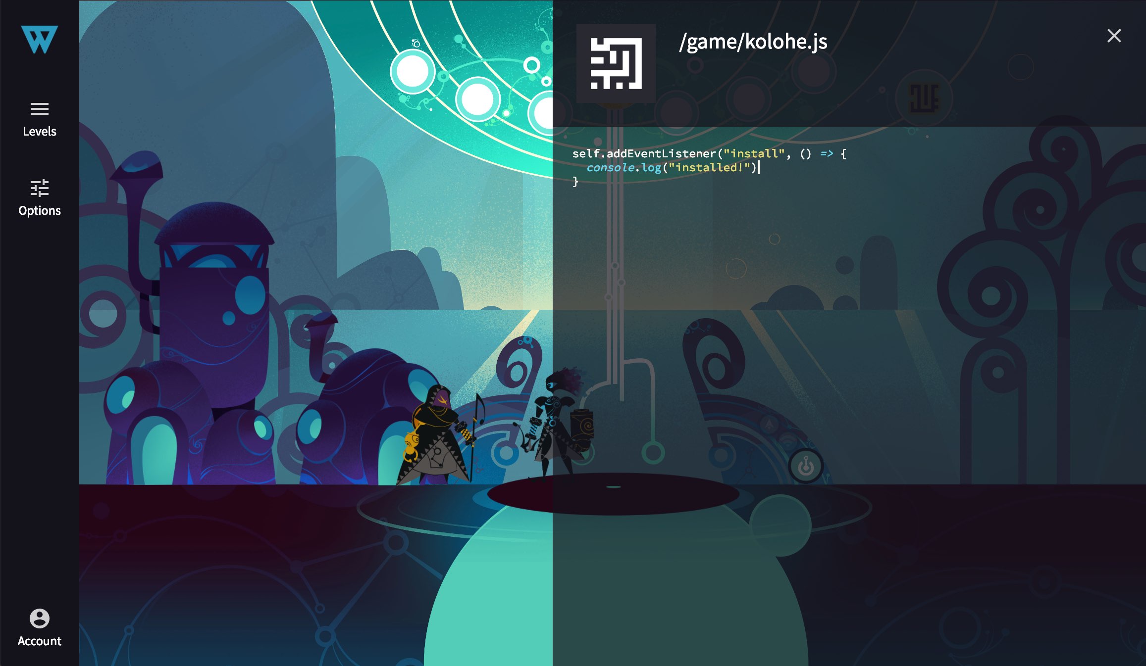
This experience is so much better, especially for smaller screens!
Asset Loading
Keeping load times small is hard enough for a regular web app. It's an even bigger challenge for a web-based game with tons of heavy assets. I realized I'd gotten used to the long loading times, which only would have gotten worse as I add a bunch more chapters each with their own artwork & sound effects.
I cracked open the Network tab in Chrome and counted 241 requests just for the game's MP3s — 32.8MB. Ouch!
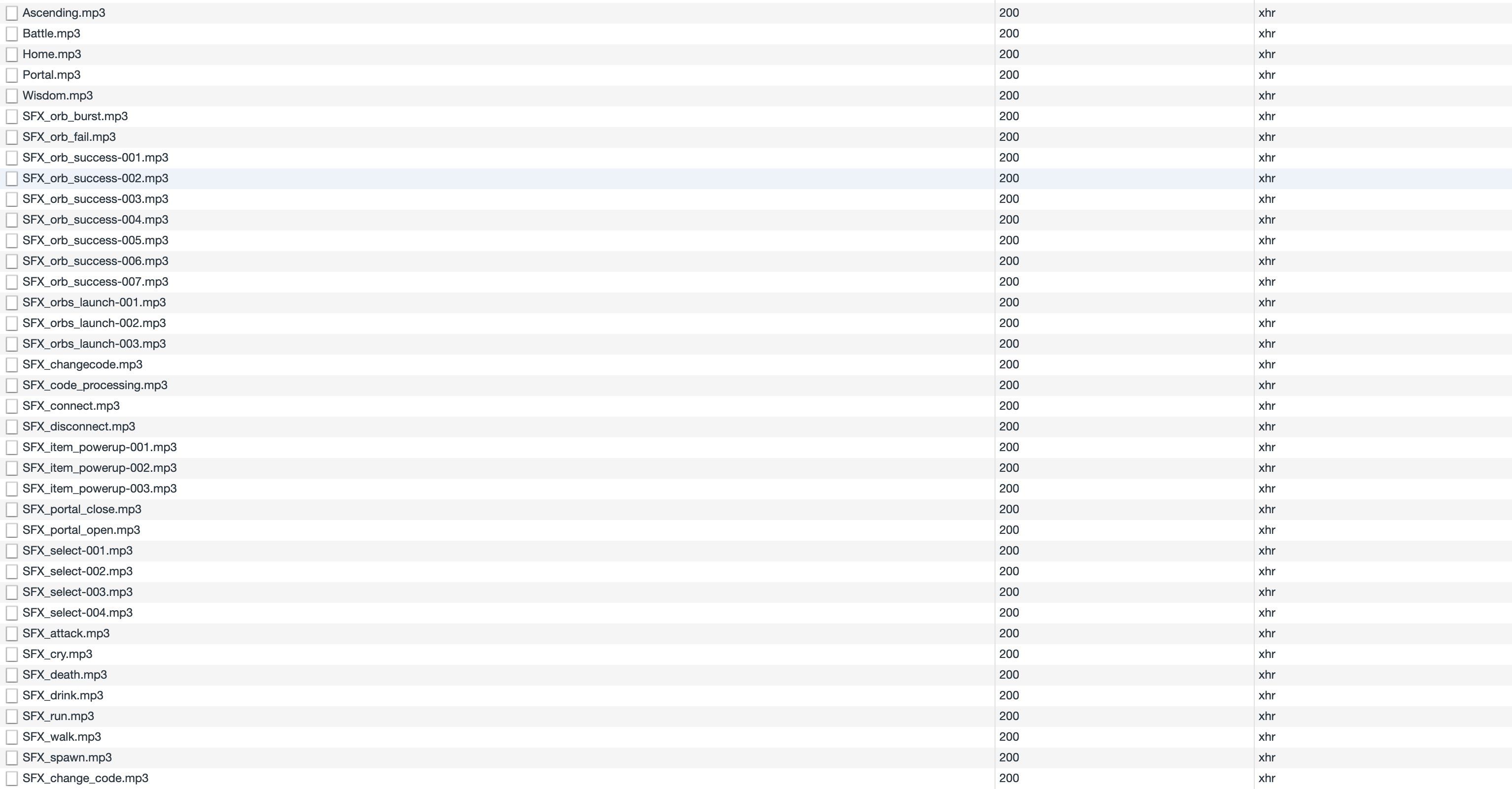
The polish for this was actually pretty easy. I added some logic to my level loader to look at all the characters being used in the current level, and automatically fetch only the assets needed for that level. So when you're fighting the Crow in chapter two you don't have to pay the cost of downloading chapter 3's Spider assets. I then keep a reference to any assets loaded so they aren't fetched more than once.
This helped a bunch but the game was still making a ton of requests for little mp3's.
Next I tried out a technique called audio sprites which means you combine a bunch of little files into one big file and have markers into it for the individual sounds. This made a huge difference — took it down to just 6 requests and 8.4MB.

I'll take this performance idea even further with Service Worker itself in a future round of polish and share how it goes.
Keyboard Shortcuts
All my games including Service Workies have a keyboard shortcut as an alternative to the Next button for advancing dialogue: cmd+enter on macOS, ctrl+enter on Windows/Linux. I often get requests for this feature even though it already exists, because users had no way to discover it on their own.
A lot of apps like Github have one central place where they list all keyboard shortcuts. I don't know about you but I never bother to look those up. I'd much rather have shortcuts discoverable in context.
So here's what I did instead: when you hover long enough over a button that has a keyboard shortcut, its shortkey appears.
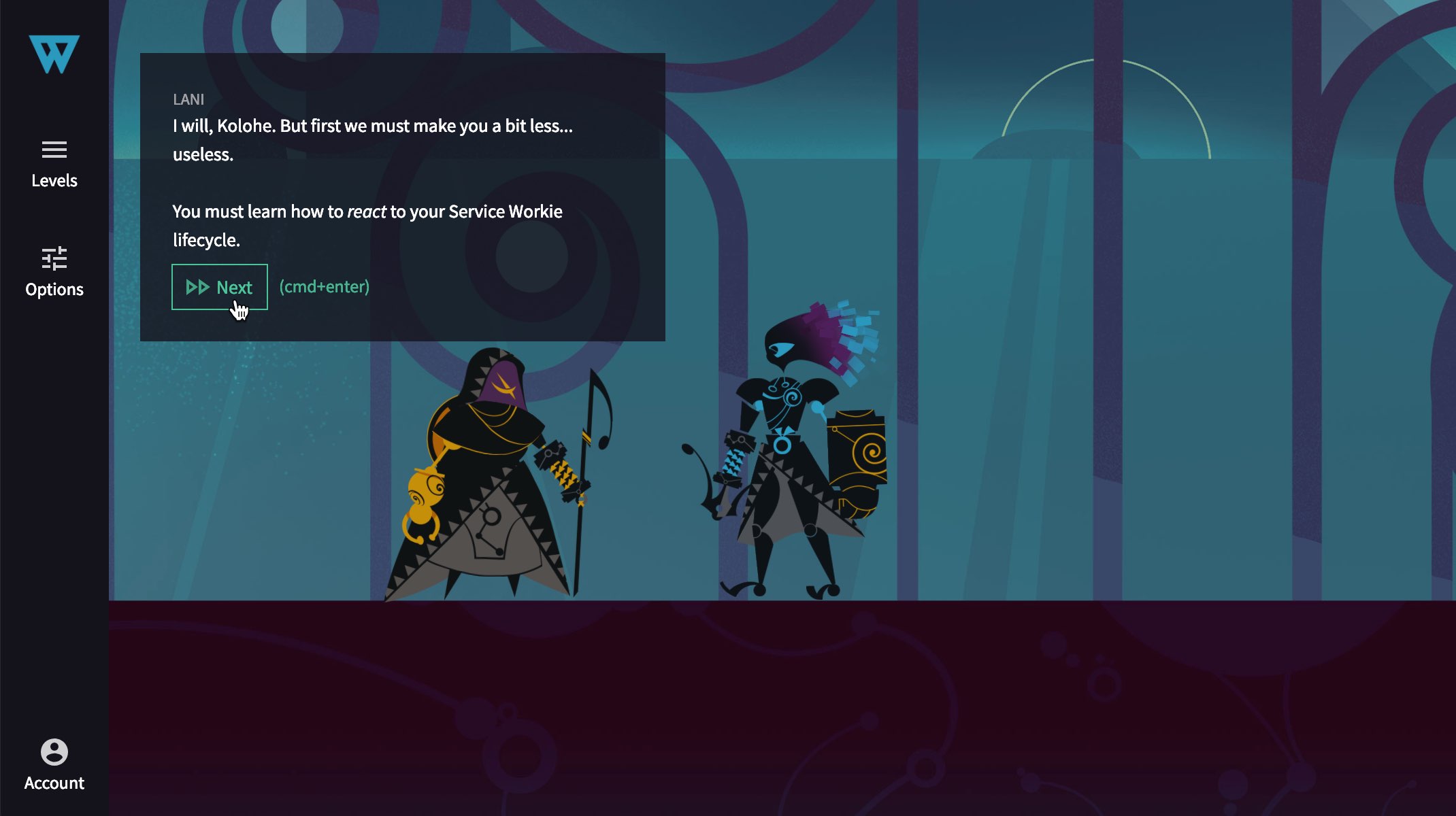
I'm a fan of this pattern and will probably use it more often. But I look forward to seeing how my users like it!
Other Bits o' Polish
For completeness here are the other things that got some polish love:
- The Portal now shows a snapshot of the Page code it last loaded
- Escape keyboard shortcut for closing the code panel and Level/Volume menus
- Select sound effect
- Locked level screen instead of just a redirect
- Hover/cursor polish in the levels menu
- Rename "game volume" to "sound effects volume"
- 50% CPU reduction thanks to audio sprites and smarter React state handling — WOOOO!
- Use regex for certain code matching
- Fine tune death animation timing
- Fade back to regular music after boss levels
- Make battle music loop while fighting
Polish Makes Perfect
Acclimation is the biggest barrier to polish. As you work you've got to keep an eye out for things you've learned to live with that others won't be willing to. Identify and remove the workarounds. Don't get discouraged or compare your work to anyone else. Just practice the art of polish — one little thing after another. Before long your skills and products will start to shine.
PWAs are the future of web apps. At their very heart is the powerful but devious Service Worker. Learn to control it inside and out, and make your web app compete with the very best of native.Master Service Workers