
CSS width vs flex-basis
What's the difference? This is by far the most common flexbox question I get. In fact I remember googling this very thing myself back when I was still just guessing with flexbox. Lemme answer this and hopefully spare you some frustration as you learn flexbox!
Flex Items Formula
Flex item (the DOM elements inside of a flex container) sizing follows this specific formula:
content —> width —> flex-basis (limted by max-width & min-width)
For determining the size of a flex item the final flex-basis bound by min-width and max-width is all that matters.
NOTE: The flexbox spec calls this the "hypothetical main size", but it's a lot simpler to think of it as the final flex-basis.
If no flex-basis is specified, then the flex-basis falls back to the item's width property.
If no width is specified, then the flex-basis falls back to the computed width of the item's contents.
Let's illustrate this formula by putting some flex items into a 1000px flex container:
.container {
  display: flex;
  width: 1000px;
}
Setting a Width
Let's put some 200px by 200px items that specify a width into our flex container.
.item {
  width: 200px;
  height: 200px;
}
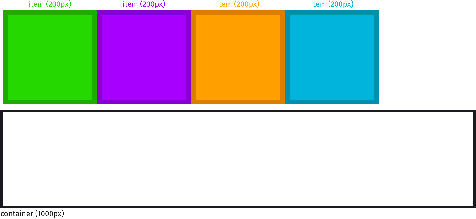
Our flex container has plenty of room so our items fit nicely into it:
In this example our items' flex-basis wasn't specified, so it defaulted to flex-basis: auto, which falls back to the width (200px).
So far, setting a width is equivalent to setting a flex-basis.
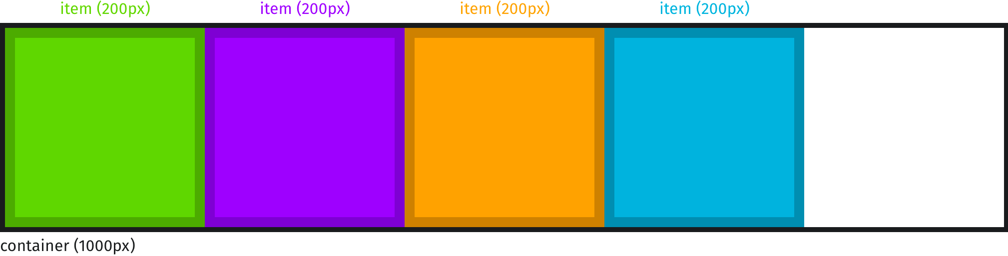
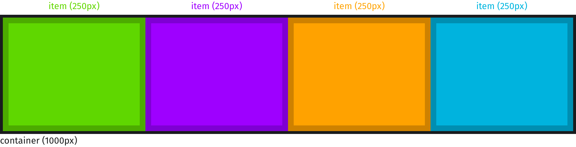
Setting a Flex Basis
Let's see what happens when we set a flex-basis on these items that already have a width specified.
.item {
  width: 30px;
  flex-basis: 250px;
}
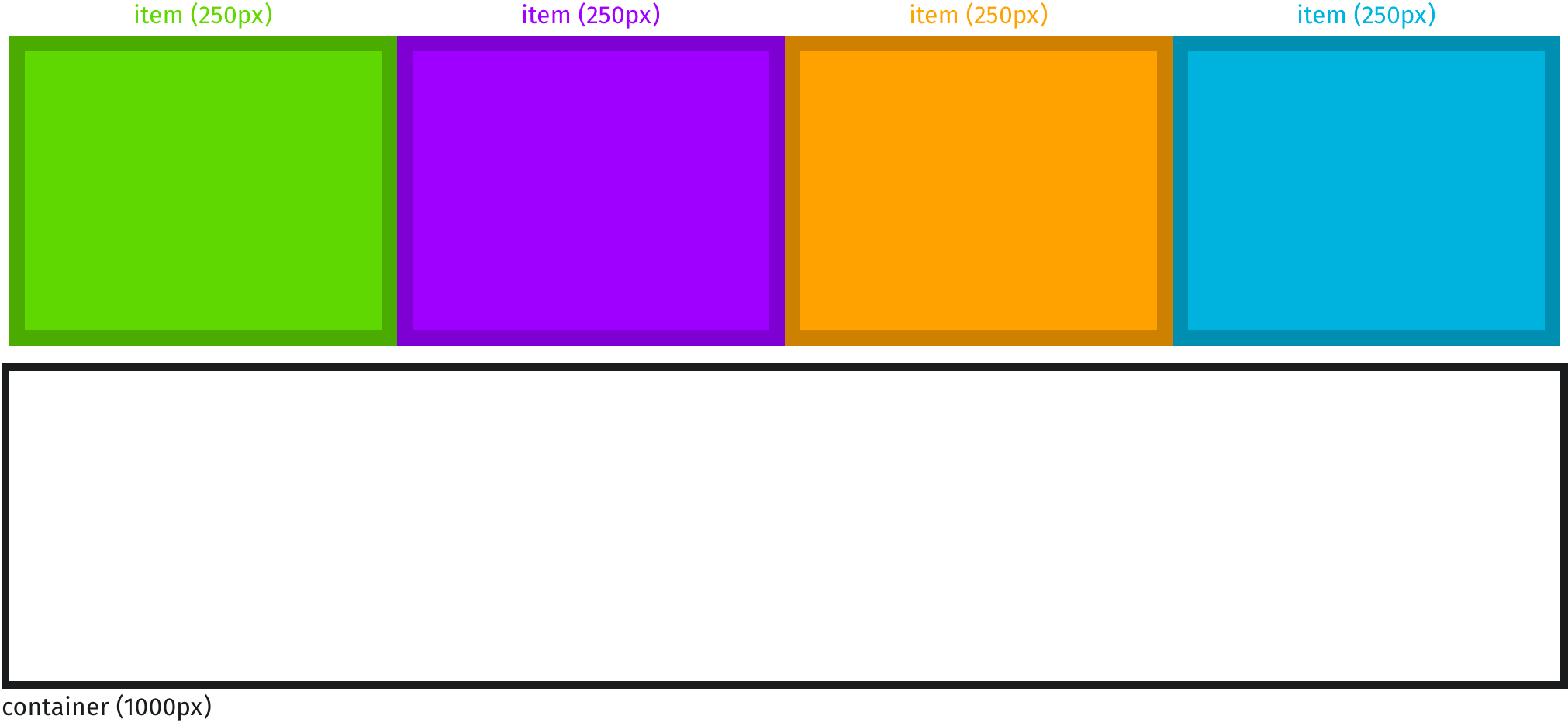
As you can see, when a flex-basis is specified, the width of our boxes is ignored, so we don't even need to specify it:
.item {
  flex-basis: 250px;
}
Our final flex-basis for each item is 250px. And since we have enough room for all of those, they'll fit nicely into their flex container:
Remember the flex items formula:
content —> width —> flex-basis (limted by max-width & min-width)
The only thing that matters is this final flex-basis. A best practice is to just use flex-basis instead of width or height. Especially since Safari still has an old flexbox bug where it won't apply flex-shrink properly to items that use height instead of flex-basis.
flex-basis is Limited by max-width
The final flex-basis value is limited by both the min-width and max-width of the item. Watch what happens when we set a max-width limit to our flex items:
.item {
  flex-basis: 250px;
  max-width: 100px;
}
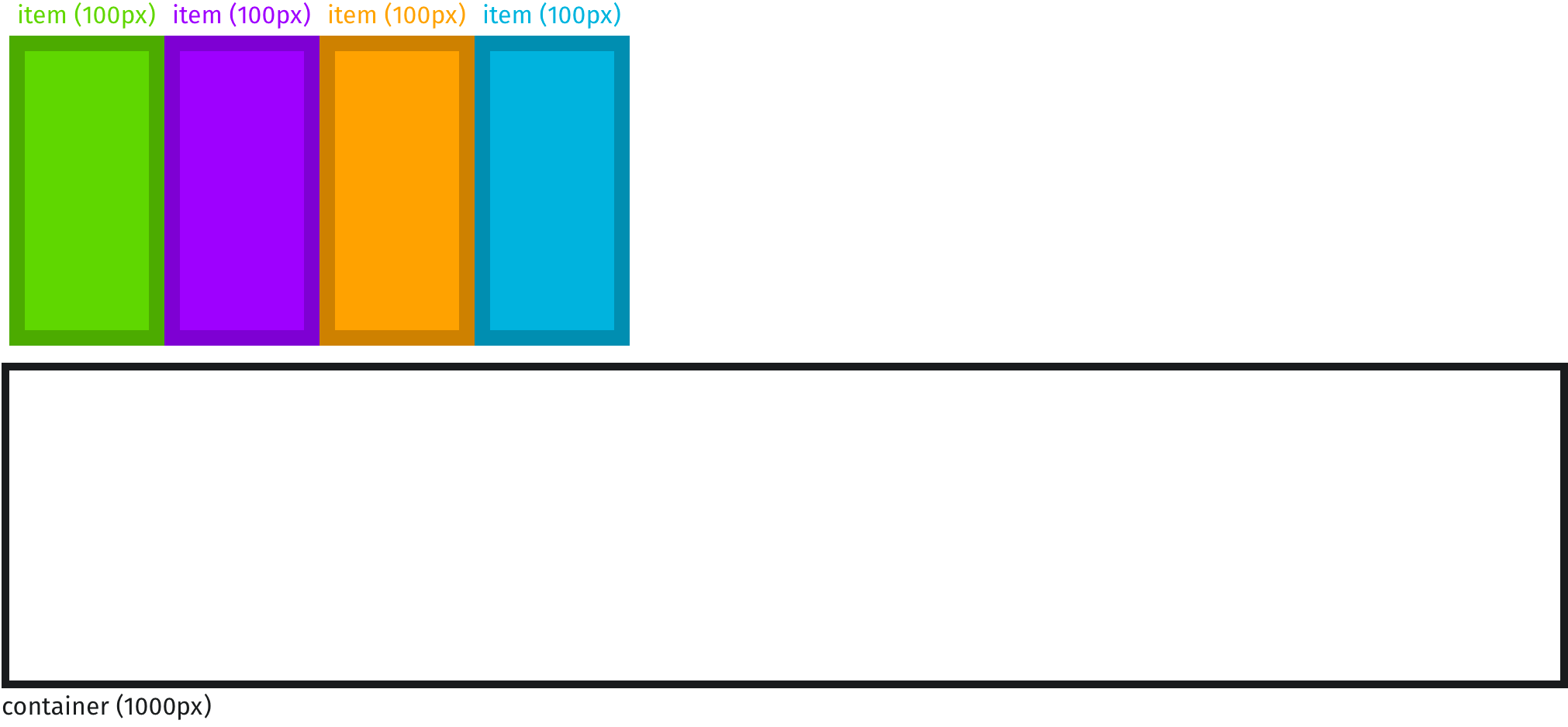
Even though our flex-basis was set to 250px, it hit the 100px max-width limit. So our final flex-basis in this case is 100px, and our items will fit into the flex container like so:
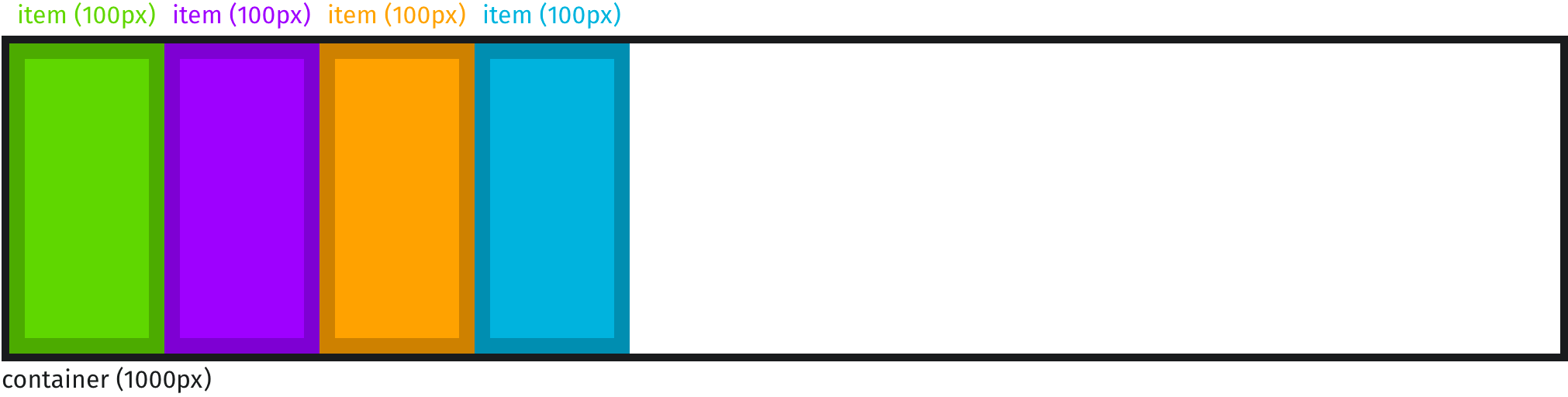
Now let's set a min-width and see how that limits our final flex-basis:
.item {
  flex-basis: 100px;
  min-width: 250px;
}
Even though we specified 100px for our flex-basis, it couldn't go lower than the 250px min-width limit. So our final flex-basis is 250px and our flex items fit perfectly into the container:
So What Exactly is flex-basis?
Now we understand that width is just a fallback when flex-basis is missing, and min-width and max-width are just upper and lower limits for the final flex-basis. So what exactly is flex-basis?
You probably noticed that in all of our illustrations we visualized the size of the flex items before they got put into the flex container. We did that because that's exactly what flex-basis is: the size of flex items before they are placed into a flex container. It's the ideal or hypothetical size of the items. But flex-basis is not a guaranteed size! As soon as the browser places the items into their flex container, things change. In some of our examples above you saw that the flex items fit perfectly into their flex container, because the total sum of all the items' final flex-basis was the exact width of our container (1000px). That's great when that happens, but often times the flex container won't have enough space, or will have extra space, after all its items' flex-basis values are added up.
When Not Enough Space
Say we wanted to put even more of these flex-basis: 200px items into our container:
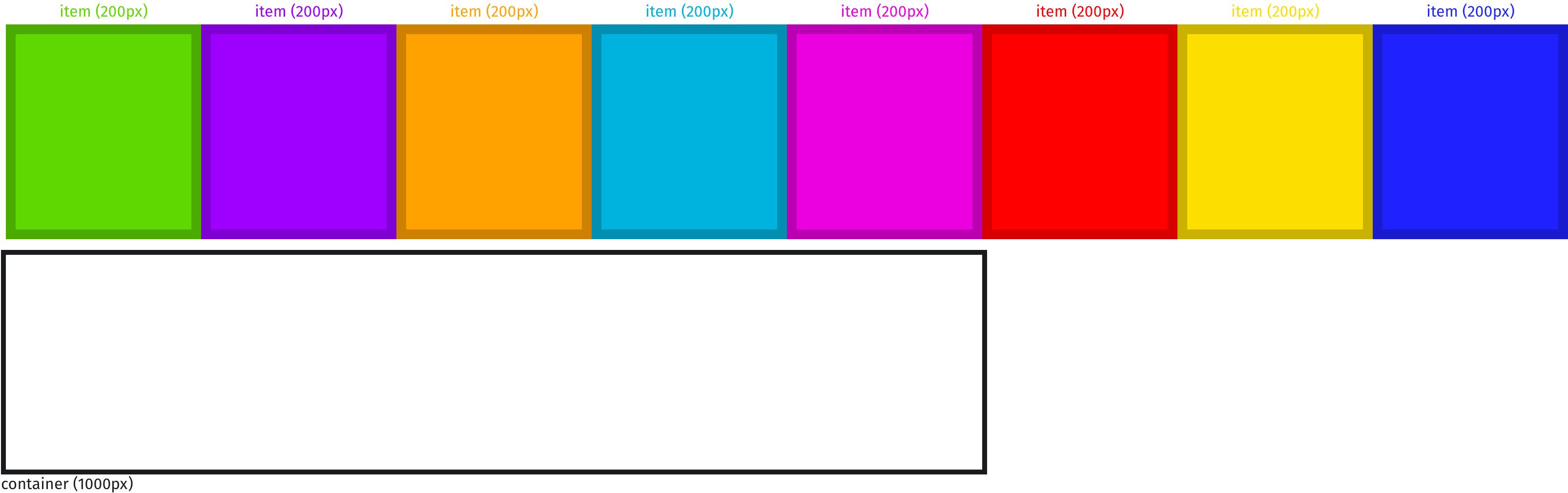
Before going into the container they would each take up 200px, or 1600px total. But our container only has 1000px available. When there's not enough room for all the items' full flex-basis (200px each) then flex items by default will shrink to fit:
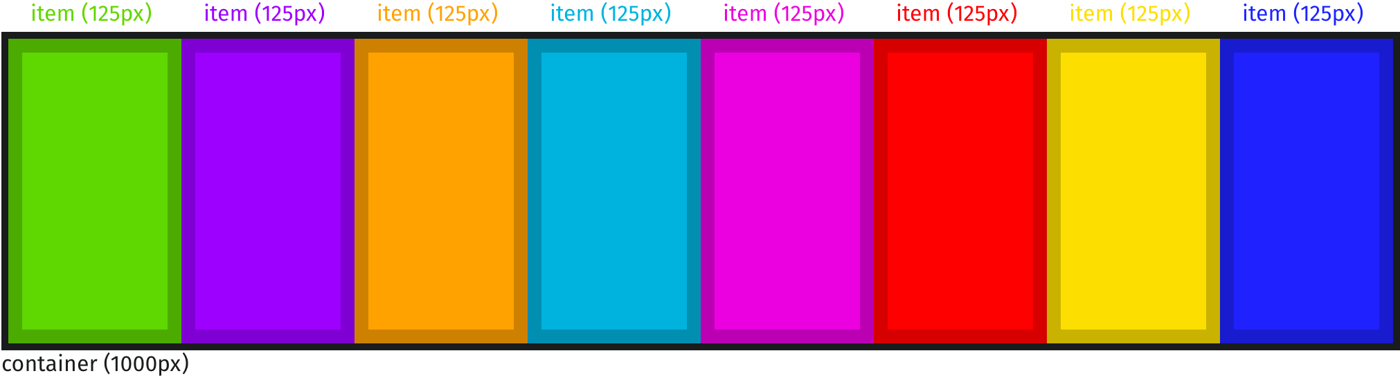
All of the items started out at 200px wide, but since we were short on space they shrunk at an even rate until they all fit (125px each). That shrink rate is what the flex-shrink ratio is all about. You can override the default to make specific items shrink faster (higher ratio) or slower (lower ratio) or not shrink at all (flex-shrink: 0).
When Extra Space Available
Often we'll have plenty of space left over after all the items' final flex-basis is added up.
.item {
  flex-basis: 100px;
}
We can instruct our flex items to grow to fill the available space once they're placed into the flex container. That's what the flex-grow property is all about. The default value is 0, meaning the item won't grow. Let's set each item to flex-grow: 1 (all grow at the same rate) to fill up the remaining space:
.item {
  flex-basis: 100px;
  flex-grow: 1;
}
Growing and shrinking is a huge part of the coolness of flexbox, and is what makes flexbox so great for responsive UI design. Flexbox Zombies Mastery Game covers flex-shrink and flex-grow in more detail.
Width vs flex-basis
Hopefully now you see the difference between width and flex-basis, and how min-width and max-width affect the final flex-basis. All of the above applies the same to height when your flex-direction is column or column-reverse. If you want to master all of flexbox once and for all, I made Flexbox Zombies Mastery Game for you, where you shoot zombies by controlling a crossbow with flexbox code. Happy hunting!
Flexbox is incredibly powerful. But it's also crazy hard to master. So we all end up depending on a cheat sheet and guessing in the dev tools. Enough of that! Time to master it once and for all, in a way that actually sticks, so you can build any layout you can imagine with flexbox.Master Flexbox