What to Do with User Feedback
Everyone talks about how important it is to get user feedback. But what do you actually do with feedback once you get it? Some of the comments you receive make you grin from ear to ear. Others make you want to delete your project repo and open up a snow cone shack instead (nobody hates snow cones). Some feedback feels completely arbitrary, like "it's not purple enough". Should you implement every suggestion that comes your way? Throw out the negative ones? Let the positive ones boost your ego? What the crabapple are you supposed to do with feedback?
A couple months ago I opened up flexbox zombies for a beta with fourty volunteers. Hilariously I had forgotten to hide the beta course so an additional ninety people went through it. As the feedback started to pile up in my inbox I devised a simple little system for how to organize & get the most out of it.
It's pretty simple: organize each piece of feedback into one of three categories: polish, pain, & patterns. Keep a tally each time something is mentioned.
Polish
These are comments from delighted users telling you what they liked. Things like:
I loved the animations and the way the flexbox teaching is integrated into an entertaining story.
From that comment you'd put a tally next to both animations and story.

From this comment:
Amazing graphics and animations! The text animation was a bit choppy, but overall the levels were a lot of fun.
we'd put another tally next to animations and a new one for graphics and fun.

Keeping track of the things that delight your users is important because it tells you where to focus your polish efforts in the future. You don't really want to double down on polishing something your users don't even notice or care about.
Pain
Most pieces of feedback like the one above will have both good and bad things to say. Rather than considering these negative comments, I like to view them in terms of pain that person is experiencing. As devs when we build our apps we get so used to the thing we're building that we don't even notice all the tiny quirks and workarounds. Getting fresh eyes on your project reveals these to you. You should welcome this kind of feedback: not only did someone give you the time of day to try the thing you made, but they also care enough about it/you to let you know about the pain they experienced. That's very valuable information and you should absolutely thank them for sharing it. Here's an example from my beta:
The dimensions of the code box is too small, I keep having to scroll the text. I'd make the code entry box taller.
Don't tally the person's suggested fix, just their underlying pain:

You'll get different suggestions that all stem from the same pains:
Probably should make the font a bit smaller so it all fits.
This person had the exact same pain as the other person but a different idea for how to fix it. That's why it's important to tally the pain rather than possible solutions for it.

Once you have a very clear picture of the pain you'll be able to decide how best to eliminate it.
Patterns
If feedback doesn't really fit into the Polish or Pain categories it goes into Patterns. Here you keep track of "everything else" until patterns emerge. For example:
The blue LCD screen feels off.
Alright, not quite a pain, kinda subjective. Still, make a tally to keep track of it.

Patterns can begin to emerge as you process more feedback:
The screen feels a bit bright compared to the rest of the game, maybe dim it a little?
Alright, another tally for the LCD screen.

At this point nothing really stands out as needing to be changed yet. Until this comment:
The faint contrast on the LCD screen (red on blue) is especially hard to read on a dim screen
Aha! The screen "feels off" and is "a bit bright" because the contrast isn't good. This last pain comment had a lot more weight and made a lot more sense because of the pattern comments. And that's exactly the goal of the Patterns category: to help you spot the non-obvious actionable pains & polish you might otherwise miss.
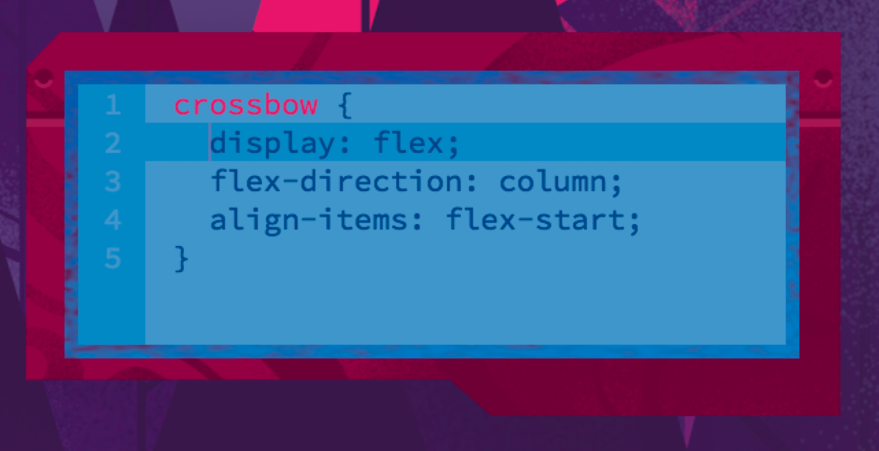
If you're curious, here is what the LCD screen looked like before this feedback:

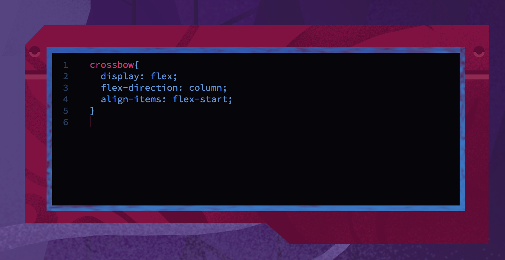
And after:

Much better!
The 3 P's
Organizing feedback into Polish, Pains, and Patterns - and tallying each mention - gives you an excellent starting point. You can now focus on eliminating the things that caused the most pain to the most people. You can work on adding more of that sweet, sweet polish to the areas that actually matter to your users. And the emergent patterns will help you know you're getting the most out of their precious feedback.
Challenge
Gather a bunch of feedback on whatever it is you're building - a feature for work, your side project, a UI element idea you prototyped, etc. Shoot for at least 10 people. Organize their feedback into the 3 P's and tally things up. What patterns emerge? What small changes could you make to eliminate a lot of the pain in the user experience?