position: sticky is Amazing
CSS just got a sweet little upgrade. position:sticky just landed in Chrome 56. Sticky positioning in CSS lets us build some really neat interactions in very few lines of code. It's useful for any time you want a UI element to stick around in view as the user is scrolling, but not become sticky until the element gets to a specific distance from the top/bottom/left/right egde of the scrolling viewport. It's like a position:fixed element that's a sleeper agent spy. It behaves just like a regular position:relative element - even fooling its own parents and siblings - until the secret distance is met, activatating the position:fixed behavior of the spy.
What Can We Build With It?
Sticky position is perfect for things like the iOS style list headings. Scroll the content and watch the headings stick once they hit 0px from the top edge.
.heading{
  background: #ccc;
  height: 50px;
  line-height: 50px;
  margin-top: 10px;
  font-size: 30px;
  padding-left: 10px;
  position: -webkit-sticky;
  position: sticky;
  top: 0px;
}
Or say you're building a Trello replacement now that they've been acquired by Atlassian (Jira) (<— sadness in my heart). And you want the list headers to stay visible if the user scrolls down. You also want the "add item" footers to be visible if they scroll up. Try it! Scroll up and down and watch how both of those elements stick around once they reach the edge of the viewport:
header{
background: #ccc;
font-size: 20px;
color: #282a37;
padding: 10px;
position: -webkit-sticky;
position: sticky;
top: 0;
}
footer{
background: #ccc;
padding: 10px;
color: #ae81fe;
position: relative;
position: -webkit-sticky;
position: sticky;
}
footer{
bottom: 0;
}
list{
border: 1px solid #ccc;
border-radius: 5px;
width: 200px;
margin-left: 20px;
background: #282a37;
}
item{
padding: 10px;
color: #fff;
display: block;
}
body{
padding-top: 20px;
display: flex;
align-items: flex-start;
}
.abs{
position: absolute;
right: 0;
top: 10px;
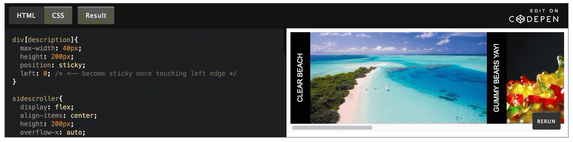
}You can also stick items to the left or right edges. Here is a sidescrolling image viewer, with rotated text descriptions of the images. Scroll it sideways and watch as the descriptions dock to the left, in view, until a new description pushes it out of the way.
div[description]{
  max-width: 40px;
  height: 300px;
  position: -webkit-sticky;
  position: sticky;
  left: 0; /* become sticky once touching left edge */
}

sidescroller{
  display: flex;
  align-items: center;
  overflow-x: auto;
  overflow-y: hidden;
  background: #000;
}

div[wrapper]{
  flex: 0 0 40px;
  max-width: 40px;
  height: 300px;
  position: -webkit-sticky;
  position: sticky;
  left: 0;
  white-space: nowrap;
  color: #fff;
}

div[item]{
  display: flex;
}

div[description] span{
  display: inline-block;
  background: rgba(0,0,0,.5);
  width: 300px;
  height: 40px;
  transform: rotate(-90deg) translateX(-300px);
  transform-origin: left top 0;
  padding-top: 11px;
  text-align: center;
  text-transform: uppercase;
  color: #fff;
  font-size: 14px;
}

img{
  max-height: 300px;
}
edit on codepen
You can even specify negative numbers when you want an element to become sticky once part or all of it is scrolled out of view! This could be useful for example with a sidebar menu that becomes sticky right when it's scrolled out of view, leaving a small button visible that when clicked could jump back to the sidebar:
.sidebar{
  background: purple;
  width: 200px;
  height: 300px;
  padding: 20px;
  flex-shrink: 0;
  overflow: visible;
  position: -webkit-sticky;
  position: sticky;
  left: -200px;
}

.sidebar .handle{
  height: 30px;
  width: 30px;
  position: absolute;
  right: -30px;
  top: 0;
  background: purple;
  color: #fff;
  font-weight: bold;
  font-size: 20px;
  padding-left: 8px;
  cursor: pointer;
}

p{
  padding: 20px;
}

.site{
  display: flex;
}
edit on codepen
Give Me This Power
Pretty neat right? And using it is straightforward.
- Declare the element as sticky with
position:sticky(plus any browser prefixes needed likeposition: -webkit-sticky) - Specify an edge (top | right | bottom | left) for the item to "stick" to.
- Enter a distance from said edge that when reached will activate the stickiness.
For example, say you want a header that becomes sticky once it gets 20px away from the top of the scroll area:
.header {
  position: -webkit-sticky;
  position: sticky;
  top: 20px;
}
Or the menu that sticks to the left edge once scrolled out of view like the example above:
.menu {
  width: 200px;
  position: -webkit-sticky;
  position: sticky;
  left: -200px;
}
Some Gotchas
position:sticky has a few gotchas you'll want to watch out for.
Siblings
If you set sibling (adjacent) elements to position: sticky, they'll behave slightly differently from elements inside of nested items. Sticky sibling elements won't move out of the way for new elements. Instead they'll overlap in place:
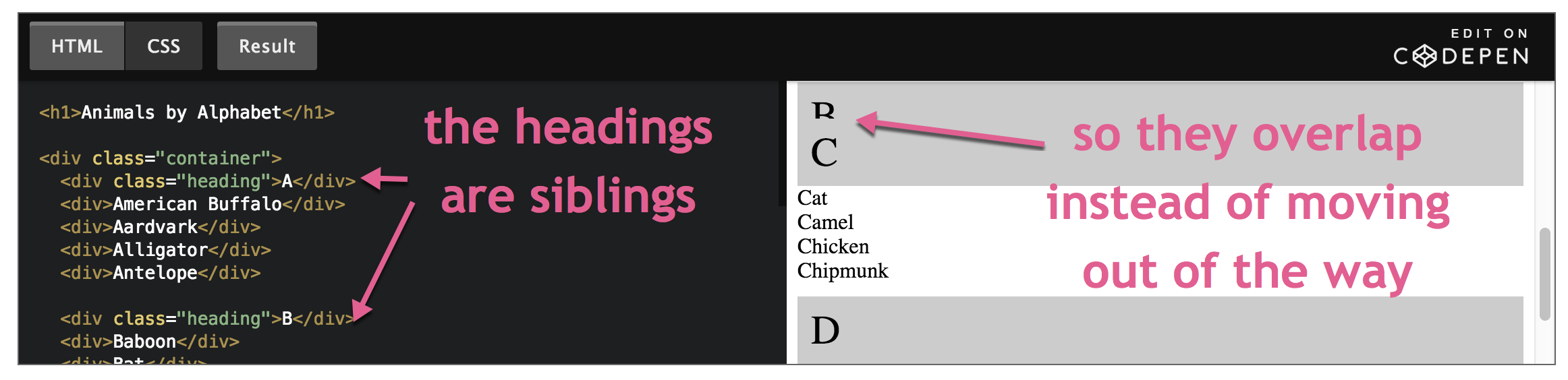
Sometimes you might want this behavior, but if you do be sure to set a background color otherwise the user will see all the items at once packed into the same little space and it will look like a mess.
On the other hand, if you nest the sticky elements into parent elements like we did in the sidescroller example, then the sticky elements will begin to move out of the way as soon as another sticky element begins to touch it. This is a good practice and the effect is a bit classier IMO:
Overflow
Don't try to use overflow: auto|scroll|hidden on the parent element of a position:sticky element. It completely breaks the stickiness. overflow: visible is fine.
Absolute Positioning
If you're wanting to use position:absolute on an element inside of a sticky element you have to be careful. If your app is running in an older browser that doesn't support position:sticky, then that sticky element won't act like a relative positioned element. So the absolute positioned element will skip it and look up the DOM tree until it finds the next non-static element (absolute | relative | fixed position), defaulting to the html element if none found. In other words, your absolute positioned element is going to be in a way different place on the screen than you expected it to be. One might think the solution for this is to just set both relative and sticky positioning if you are building something for older browsers:
/* WARNING don't do this */
.footerWithAbsolutePositionedChildren {
  position: relative; /* <-- all browsers will set this */
  position: sticky; /* <-- new browsers will use this, old ones will ignore it */
  bottom: 20px;
}
Good right? Nope, this is bad idea because of non-zero sticky numbers. If position:sticky isn't supported in a browser, your footer will stay with the position: relative you specified first. So now that edge value you specified for stickiness is now going to count as a relative value. Which in this case means pushing the footer up 20px which is not at all what we intended.
The better solution is to use the CSS supports at-rule to detect if the current browser supports sticky positioning, and if so then set the edge value:
.footerWithAbsolutePositionedChildren {
  position: relative; /* don't forget this */
}

/* NOTE: @supports has to be at the root, not nested */
@supports (position: sticky) {
  .footerWithAbsolutePositionedChildren {
    position: sticky;
    bottom: 20px; /* now this won't mess with positioning in non-sticky browsers */
  }
}
Why Not Use JavaScript?
You could definitely implement this is JS. But that would involve a scroll event listener, which is still a very expensive thing to add to your app. Scrolling is one of the most frequent actions your users perform, and executing JavaScript during those events makes it hard to maintain a solid 60 FPS (frames per second) scroll. The UI becomes out of sync with the user's mouse/finger/stylus. This is called scroll jank. There is a special kind of event listener called passive event listeners that lets the browser know your event won't stop scrolling, so the browser can optimize these events a lot more. But they're not supported yet in IE or Edge where you'd want a JS fallback approach anyway.
Additionally, with position:sticky you aren't writing to the DOM during scrolling, so you won't be causing any forced layouts & layout recalculations. As a result, the browser is able to move this operation to the GPU and you get very smooth scrolling even when sticky elements are in play. It's especially smooth in mobile Sarari.
Plus it's simply easier to write two lines of declarative CSS than the JS alternatives.
Can I Use This Now?
position:sticky is supported in all evergreen browsers. IE doesn't matter at this point unless you're contractually obligated in Enterprise Town (thanks, Sales). There are many polyfills out there if you absolutely have to have this behavior, but they all use JavaScript so you'll take the performance hit mentioned above. A better option is to design your app so that sticky position is a slick addition, but the app still functions without it. So I give it a thumbs up.
Flexbox is incredibly powerful. But it's also crazy hard to master. So we all end up depending on a cheat sheet and guessing in the dev tools. Enough of that! Time to master it once and for all, in a way that actually sticks, so you can build any layout you can imagine with flexbox.Master Flexbox