How to Pin an Element to the Center of its Parent
Centering things in CSS can sometimes seem impossible. Especially if the child to be centered has a dynamic width or height, or is actually larger than its parent element.
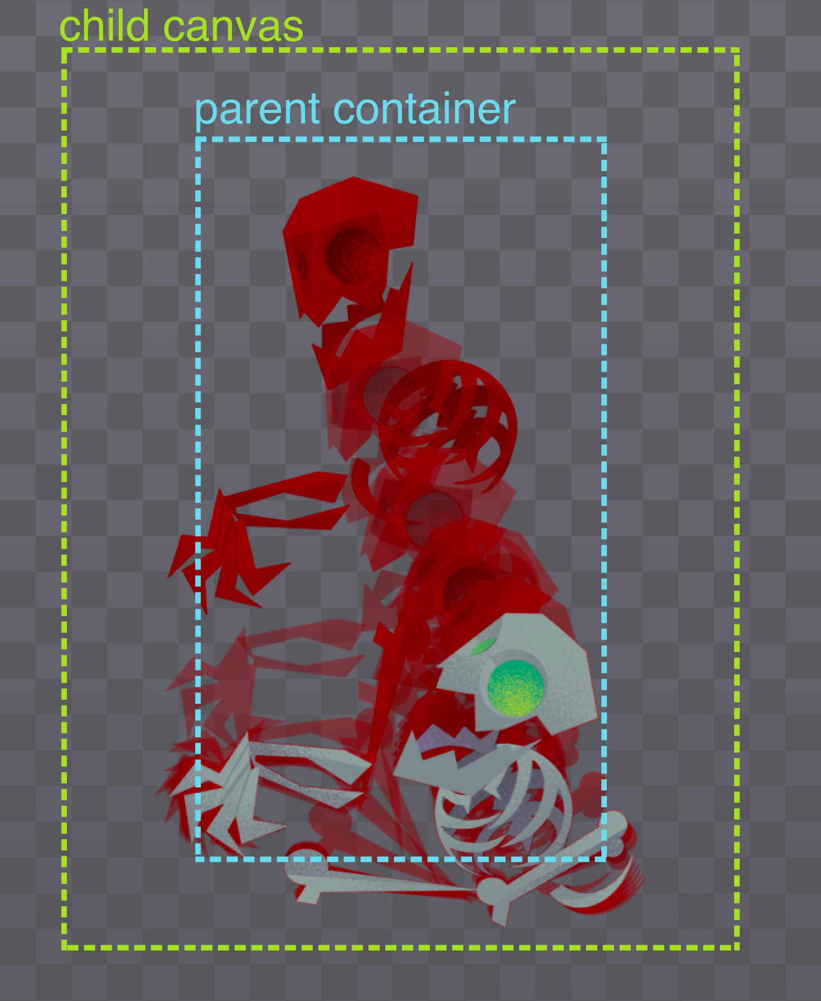
Pinning a child element to the center of its parent has a lot of uses. While building the zombie bones in my game I needed a way for the container (parent element) to take up a specific height and width regardless of the size of its content, and have the animation canvas (child element) be centered perfectly even though it's larger than its parent. This allows the zombies in my game to take up a predictable space, but let their animations bleed outside the set space without getting clipped.

Luckily for us, this is actually pretty easy with a little flexbox magic!
Pin Child to Parent
On the parent element all we have to do is:
- set the parent container element to use flexbox
- center its children horizontally with
justify-content - center its children vertically with
align-items
.parent-container {
  display: flex;
  justify-content: center;
  align-items: center;
}
One important thing not to miss on the child element is to tell it not to shrink. Otherwise the child will squish down to the width of its parent instead of staying its full width like we want.
.child-canvas {
  flex-shrink: 0;
}
Here is an example you can play with:
.parent{
  width: 200px;
  height: 300px;
  display: flex;
  justify-content: center;
  align-items: center;
  border: 5px dashed #6BD9ED;
}

.child{
  width: 300px;
  height: 400px;
  flex-shrink: 0;
  border: 5px dashed #A7E040;
}
Shifting the Position of the Child
Once you have this setup, you can easily make adjustments to the position of the child element. For example if you'd rather you can pin it to the top of the parent:
.parent{
  width: 200px;
  height: 300px;
  display: flex;
  justify-content: center;
  align-items: flex-start;
  border: 5px dashed #6BD9ED;
}

.child{
  width: 300px;
  height: 400px;
  flex-shrink: 0;
  border: 5px dashed #A7E040;
}
Or pin it to the bottom left:
.parent{
  width: 200px;
  height: 300px;
  display: flex;
  justify-content: flex-start;
  align-items: flex-end;
  border: 5px dashed #6BD9ED;
}

.child{
  width: 300px;
  height: 400px;
  flex-shrink: 0;
  border: 5px dashed #A7E040;
}
Even after you've pinned it, you can make tiny little adjustments using relative positioning on the child to get it just where you want it:
.parent{
  width: 200px;
  height: 300px;
  display: flex;
  justify-content: center;
  align-items: center;
  border: 5px dashed #6BD9ED;
}

.child{
  width: 300px;
  height: 400px;
  flex-shrink: 0;
  border: 5px dashed #A7E040;
  position: relative;
  right: -15px
}
Sweet right?
Now that you know how to pin elements to their parents you can center layouts quite easily. Flexbox is super powerful for this and many other UI needs. Flexbox Zombies covers it all in gritty (gory?) detail!
Here's your homework: Go play with the codepen examples above and look for a way to use this to simplify one of your existing centering hacks.