Article Layout with CSS Grid
Yesterday I shipped my brand new gedd.ski site. This new version is built with my dream stack and I'll write up a post on that soon (spoiler: Gatsby and MDX are game-changers).
For the blog post page (the page you're looking at right now) I wanted a mobile-friendly layout where the text was centered and readable, where the images/code examples are wide. Similar to the layout on Medium.com (minus the desperate popups begging people to sign up & pay).
I discovered a pretty exciting & simple way to accomplish this layout with CSS Grid. Check it out!
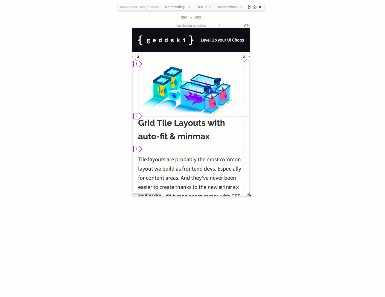
Ready to have your mind blown? Look how easy grid makes this:
.post {
  display: grid;
  grid-template-columns:
    minmax(1.2rem, 1fr)
    minmax(auto, 57ch)
    minmax(1.2rem, 1fr);
}
This code creates three flexible grid columns.
The outer columns use minmax(1.2rem, 1fr). This makes these columns a minimum width of 1.2rem and a maxiumum width of 1fr.
The inner column for text uses minmax(auto, 57ch). The minimum size of auto makes the column size to the width of the text as it wraps — so it looks great on tiny screens. The maximum size of 57ch makes sure that column never gets bigger than 57 characters, keeping the text from getting too wide and unreadable on huge screens.
Here's a live example you can play with!
.post {
  display: grid;
  grid-template-columns: minmax(1.2rem, 1fr) minmax(auto, 57ch) minmax(1.2rem, 1fr);
}

/* position text paragraphs into the second (middle) column */
p {
  grid-column: 2;
}

/* position images to take up all three columns */
img {
  grid-column: 1 / 4;
  width: 100%;
  max-width: 100ch;
  justify-self: center;
}
The only other thing to note is how we positioned the items into the grid using grid-column.
Play with the above code and see how it reacts if you change the size of the columns or the item positioning. Remember the grid tracks are invisible, but you can see 'em with your browser's Grid Inspector.
Suspiciously Easy

Sure, we could have built this layout using oldschool CSS: add in a couple of wrapper divs, don't forget padding and auto margin, set max-width, throw in a couple of media queries, and we're done.
But Grid makes it easy. And intuitive. And maintainable. CSS has needed something like this for a loooong time.
CSS Grid is the gift that keeps on giving. The building blocks it adds to the web are pretty simple. But we're only beginning to discover the awesome ways we can combine them to build awesome stuff!
Master CSS Grid right from the start by playing this new mastery game. You'll learn the ins and outs of Grids one fun level at a time, while saving an adorable alien life form from certain destruction.Master CSS Grid